In the previous lab, we learned how to work with dimension reduction in a relatively simple dataset. In this lab we are going to work with a much larger dataset: a subset of the US Census & Crime data (Redmond 2009). Details about the various variables can be found here.
How can we tackle a dataset with 100 different dimensions? We try using PCA and clustering. There is a lot you can do with this dataset. We encourage you to dig in. Try and find some interesting patterns in the data. Even upload your findings to the Teams channel and discuss.
18.1 Data
import warningswarnings.filterwarnings('ignore')import pandas as pddf = pd.read_csv('data/censusCrimeClean.csv')df
communityname
fold
population
householdsize
racepctblack
racePctWhite
racePctAsian
racePctHisp
agePct12t21
agePct12t29
...
NumStreet
PctForeignBorn
PctBornSameState
PctSameHouse85
PctSameCity85
PctSameState85
LandArea
PopDens
PctUsePubTrans
ViolentCrimesPerPop
0
Lakewoodcity
1
0.19
0.33
0.02
0.90
0.12
0.17
0.34
0.47
...
0.00
0.12
0.42
0.50
0.51
0.64
0.12
0.26
0.20
0.20
1
Tukwilacity
1
0.00
0.16
0.12
0.74
0.45
0.07
0.26
0.59
...
0.00
0.21
0.50
0.34
0.60
0.52
0.02
0.12
0.45
0.67
2
Aberdeentown
1
0.00
0.42
0.49
0.56
0.17
0.04
0.39
0.47
...
0.00
0.14
0.49
0.54
0.67
0.56
0.01
0.21
0.02
0.43
3
Willingborotownship
1
0.04
0.77
1.00
0.08
0.12
0.10
0.51
0.50
...
0.00
0.19
0.30
0.73
0.64
0.65
0.02
0.39
0.28
0.12
4
Bethlehemtownship
1
0.01
0.55
0.02
0.95
0.09
0.05
0.38
0.38
...
0.00
0.11
0.72
0.64
0.61
0.53
0.04
0.09
0.02
0.03
...
...
...
...
...
...
...
...
...
...
...
...
...
...
...
...
...
...
...
...
...
...
1989
TempleTerracecity
10
0.01
0.40
0.10
0.87
0.12
0.16
0.43
0.51
...
0.00
0.22
0.28
0.34
0.48
0.39
0.01
0.28
0.05
0.09
1990
Seasidecity
10
0.05
0.96
0.46
0.28
0.83
0.32
0.69
0.86
...
0.00
0.53
0.25
0.17
0.10
0.00
0.02
0.37
0.20
0.45
1991
Waterburytown
10
0.16
0.37
0.25
0.69
0.04
0.25
0.35
0.50
...
0.02
0.25
0.68
0.61
0.79
0.76
0.08
0.32
0.18
0.23
1992
Walthamcity
10
0.08
0.51
0.06
0.87
0.22
0.10
0.58
0.74
...
0.01
0.45
0.64
0.54
0.59
0.52
0.03
0.38
0.33
0.19
1993
Ontariocity
10
0.20
0.78
0.14
0.46
0.24
0.77
0.50
0.62
...
0.08
0.68
0.50
0.34
0.35
0.68
0.11
0.30
0.05
0.48
1994 rows × 102 columns
Do-this-yourself: Let’s say “hi” to the data
You have probably learnt by now that the best start to working with a new data set is to get to know it. What would be a good way to approach this?
A few steps we always take: - Use the internal spreadsheet viewer in JupyterLab, go into the data folder and have a look at the data. - Check the size of the dataset. Do you remember how to look at the shape of a dataset? - Get a summary of the data, observe the descriptive statistics. - Check the data types and see if there are mixes of different types, such as numerical, categorical, textual, etc.. - Create a visualisation to get a first peek into the relations. Think about the number of features. Is a visualisation feasible?
Do-this-yourself: Check if we need to do any normalisation for this case?
What are the descriptive statistics look like, see if we need to do anything more?
Usually a standardisation is recommended before you apply PCA on a dataset. Here is that link again – https://scikit-learn.org/stable/modules/generated/sklearn.preprocessing.StandardScaler.html
18.2 Principal Component Analysis
Note for the above: In case you wondered, we have done some cleaning and preprocessing on this data to make things easier for you, so normalisation might not be needed or at least won’t make a lot of difference to the results. But the real life will always be much more messier.
OK, you probably have noticed that there is a lot of data features we have here. Let’s start experimenting with the PCA technique and see what it could surface. Maybe it will help us reduce the dimensionality a little but and tell us something about the features.
from sklearn.decomposition import PCAn_components =2pca = PCA(n_components=n_components)df_pca = pca.fit(df.iloc[:, 1:])
df_pca.explained_variance_ratio_
array([0.67387831, 0.08863102])
What do these numbers mean?
df_pca_vals = pca.fit_transform(df.iloc[:,1:])df['c1'] = [item[0] for item in df_pca_vals]df['c2'] = [item[1] for item in df_pca_vals]
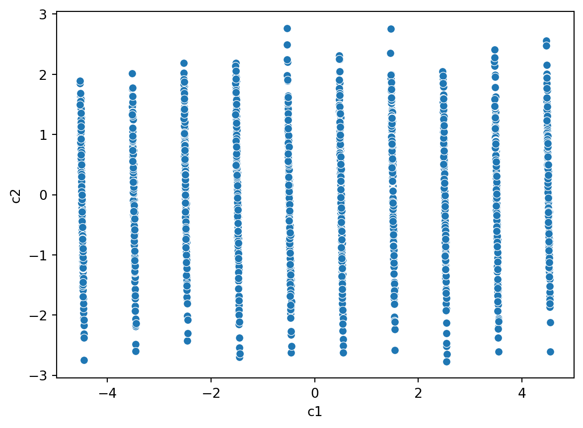
import seaborn as snssns.scatterplot(data = df, x ='c1', y ='c2')
Hmm, that looks problematic. What is going on? When you see patterns like this, you will need to take a step back and look at everything closely.
We should look at the component loadings. Though there are going to be over 200 of them. We can put them into a Pandas dataframe and then sort them.
Do you notice anything extraordinary within these variable loadings?
Remember, the variable loadings tell us to what extent the information encoded along a principal component axis is determined by a single variable. In other words, how important a variable is. Haev a look and see if anything is too problematic here.
The fold variable is messing with our PCA. What does that variable look like.
Aha! It looks to be some sort of categorical variable. Looking into the dataset more, it is actually a variable used for cross tabling.
We should not include this variable in our analysis.
df.iloc[:, 2:-2]
population
householdsize
racepctblack
racePctWhite
racePctAsian
racePctHisp
agePct12t21
agePct12t29
agePct16t24
agePct65up
...
NumStreet
PctForeignBorn
PctBornSameState
PctSameHouse85
PctSameCity85
PctSameState85
LandArea
PopDens
PctUsePubTrans
ViolentCrimesPerPop
0
0.19
0.33
0.02
0.90
0.12
0.17
0.34
0.47
0.29
0.32
...
0.00
0.12
0.42
0.50
0.51
0.64
0.12
0.26
0.20
0.20
1
0.00
0.16
0.12
0.74
0.45
0.07
0.26
0.59
0.35
0.27
...
0.00
0.21
0.50
0.34
0.60
0.52
0.02
0.12
0.45
0.67
2
0.00
0.42
0.49
0.56
0.17
0.04
0.39
0.47
0.28
0.32
...
0.00
0.14
0.49
0.54
0.67
0.56
0.01
0.21
0.02
0.43
3
0.04
0.77
1.00
0.08
0.12
0.10
0.51
0.50
0.34
0.21
...
0.00
0.19
0.30
0.73
0.64
0.65
0.02
0.39
0.28
0.12
4
0.01
0.55
0.02
0.95
0.09
0.05
0.38
0.38
0.23
0.36
...
0.00
0.11
0.72
0.64
0.61
0.53
0.04
0.09
0.02
0.03
...
...
...
...
...
...
...
...
...
...
...
...
...
...
...
...
...
...
...
...
...
...
1989
0.01
0.40
0.10
0.87
0.12
0.16
0.43
0.51
0.35
0.30
...
0.00
0.22
0.28
0.34
0.48
0.39
0.01
0.28
0.05
0.09
1990
0.05
0.96
0.46
0.28
0.83
0.32
0.69
0.86
0.73
0.14
...
0.00
0.53
0.25
0.17
0.10
0.00
0.02
0.37
0.20
0.45
1991
0.16
0.37
0.25
0.69
0.04
0.25
0.35
0.50
0.31
0.54
...
0.02
0.25
0.68
0.61
0.79
0.76
0.08
0.32
0.18
0.23
1992
0.08
0.51
0.06
0.87
0.22
0.10
0.58
0.74
0.63
0.41
...
0.01
0.45
0.64
0.54
0.59
0.52
0.03
0.38
0.33
0.19
1993
0.20
0.78
0.14
0.46
0.24
0.77
0.50
0.62
0.40
0.17
...
0.08
0.68
0.50
0.34
0.35
0.68
0.11
0.30
0.05
0.48
1994 rows × 100 columns
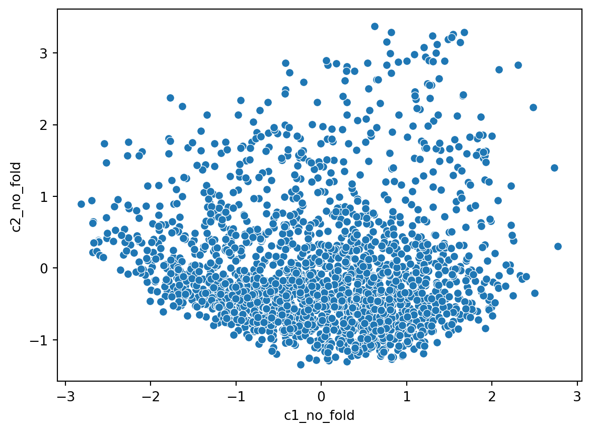
from sklearn.decomposition import PCAn_components =2pca_no_fold = PCA(n_components=n_components)df_pca_no_fold = pca_no_fold.fit(df.iloc[:, 2:-2])df_pca_vals = pca_no_fold.fit_transform(df.iloc[:, 2:-2])df['c1_no_fold'] = [item[0] for item in df_pca_vals]df['c2_no_fold'] = [item[1] for item in df_pca_vals]sns.scatterplot(data = df, x ='c1_no_fold', y ='c2_no_fold')
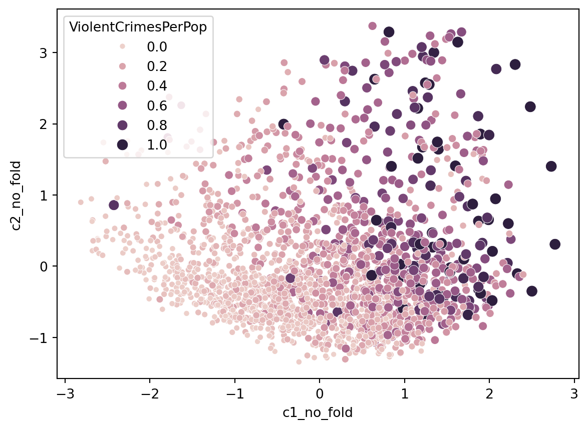
Interesting that our first component variables are income related whereas our second component variables are immigration related. If we look at the projections of the model, coloured by Crime, what do we see?
sns.scatterplot(data = df, x ='c1_no_fold', y ='c2_no_fold', hue ='ViolentCrimesPerPop', size ='ViolentCrimesPerPop')
18.3 Clustering
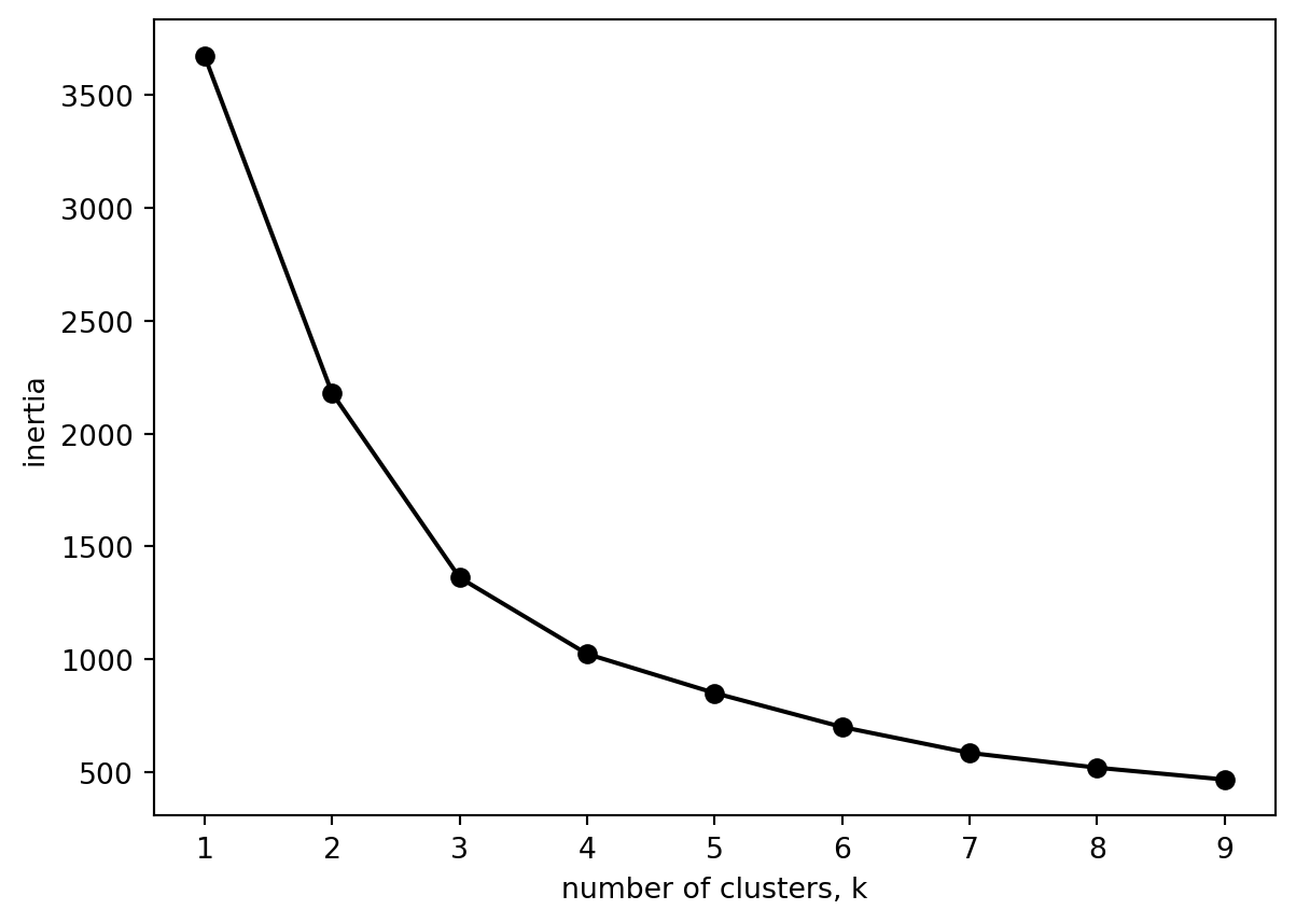
What about clustering using these income and immigration components?
18.3.1 Defining number of clusters
from sklearn.cluster import KMeansks =range(1, 10)inertias = []for k in ks:# Create a KMeans instance with k clusters: model model = KMeans(n_clusters=k, n_init =10)# Fit model to samples model.fit(df[['c1_no_fold', 'c2_no_fold']])# Append the inertia to the list of inertias inertias.append(model.inertia_)import matplotlib.pyplot as pltplt.plot(ks, inertias, '-o', color='black')plt.xlabel('number of clusters, k')plt.ylabel('inertia')plt.xticks(ks)plt.show()
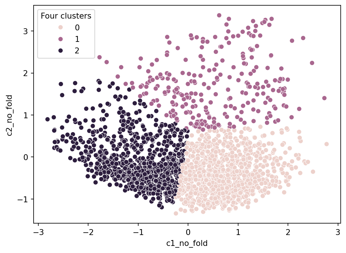
sns.scatterplot(data = df, x ='c1_no_fold', y ='c2_no_fold', hue ='Four clusters')
Hmm, might we interpret this plot? The plot is unclear. Let us assume c1 is an income component and c2 is an immigration component. Cluster 0 are places high on income and low on immigration. Cluster 2 are low on income and low on immigration. The interesting group are those high on immigration and relatively low on income.
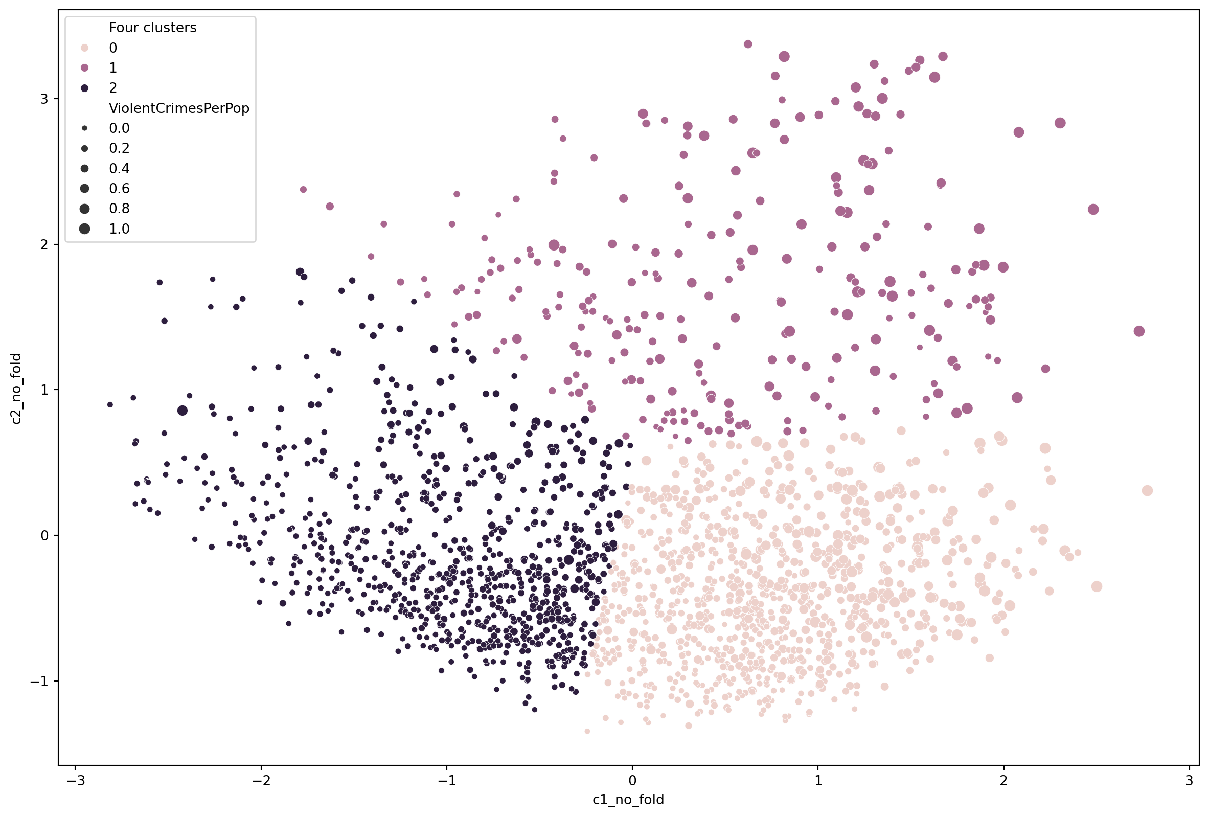
We can include crime on the plot.
import matplotlib.pyplot as pltplt.rcParams["figure.figsize"] = (15,10)sns.scatterplot(data = df, x ='c1_no_fold', y ='c2_no_fold', hue ='Four clusters', size ='ViolentCrimesPerPop')
Alas, we stop here in this exercise. You could work on this further. There are outliers you might want to remove. Or, at this stage, you might want to look at more components, 3 or 4 and look for some other factors.