%matplotlib inline
import pandas as pd
import matplotlib.pyplot as plt
df = pd.read_excel('data/WDI_countries_v2.xlsx', sheet_name='Data4')33 Lab: Poverty and Inequality
The idea of measuring Poverty and Inequality using the case study on “The Statistics of Poverty and Inequality” (Rouncefield 1995). The questions that Mary Rouncefield asked her students were the following:
- Is the world’s wealth distributed evenly? What countries are outliers?
- Do people living in different countries have similar life expectancies?
- Do men and women have similar life expectancies? What is the average difference? What is the minimum difference? What is the maximum difference? In which countries do these occur? What are possible explanations for these differences?
- Are birth rates related to death rates?
- How quickly are populations growing?
By looking into 6 variables, you can investigate some major inequalites across the globe.
33.1 Source
In this lab, we will be using World Development Indicators dataset from the World Bank, which contains the following features: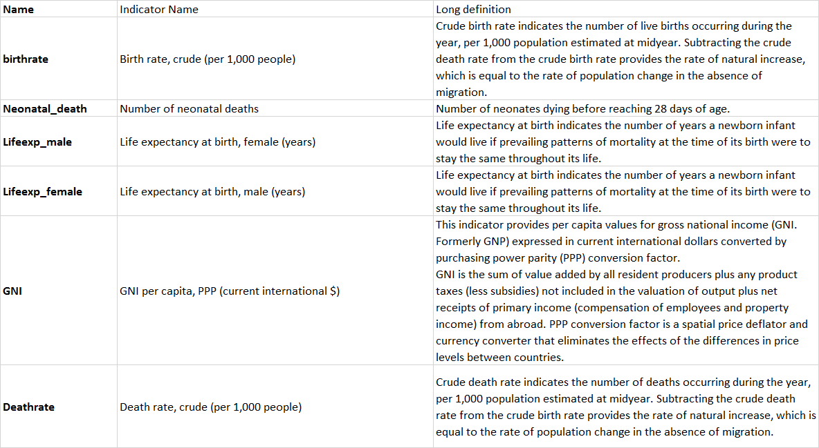
33.2 Reading the dataset
Let’s have a look at our dataset
df.head()| Country Code | birthrate | Deathrate | GNI | Lifeexp_female | Lifeexp_male | Neonatal_death | |
|---|---|---|---|---|---|---|---|
| 0 | AFG | 32.487 | 6.423 | 2260.0 | 66.026 | 63.047 | 44503.0 |
| 1 | ALB | 11.780 | 7.898 | 13820.0 | 80.167 | 76.816 | 243.0 |
| 2 | DZA | 24.282 | 4.716 | 11450.0 | 77.938 | 75.494 | 16407.0 |
| 3 | AND | 7.200 | 4.400 | NaN | NaN | NaN | 1.0 |
| 4 | AGO | 40.729 | 8.190 | 6550.0 | 63.666 | 58.064 | 35489.0 |
33.2.1 Missing values
Let’s check if we have any missing data
df.info()
df.isna().sum()
<class 'pandas.core.frame.DataFrame'>
RangeIndex: 216 entries, 0 to 215
Data columns (total 7 columns):
# Column Non-Null Count Dtype
--- ------ -------------- -----
0 Country Code 216 non-null object
1 birthrate 205 non-null float64
2 Deathrate 205 non-null float64
3 GNI 187 non-null float64
4 Lifeexp_female 198 non-null float64
5 Lifeexp_male 198 non-null float64
6 Neonatal_death 193 non-null float64
dtypes: float64(6), object(1)
memory usage: 11.9+ KBCountry Code 0
birthrate 11
Deathrate 11
GNI 29
Lifeexp_female 18
Lifeexp_male 18
Neonatal_death 23
dtype: int64Looks like there are null values in all but one column (Country Code)
# Let's look at the distribution of values in the birthrate and deathrate columns
df.boxplot(column=['birthrate', 'Deathrate'])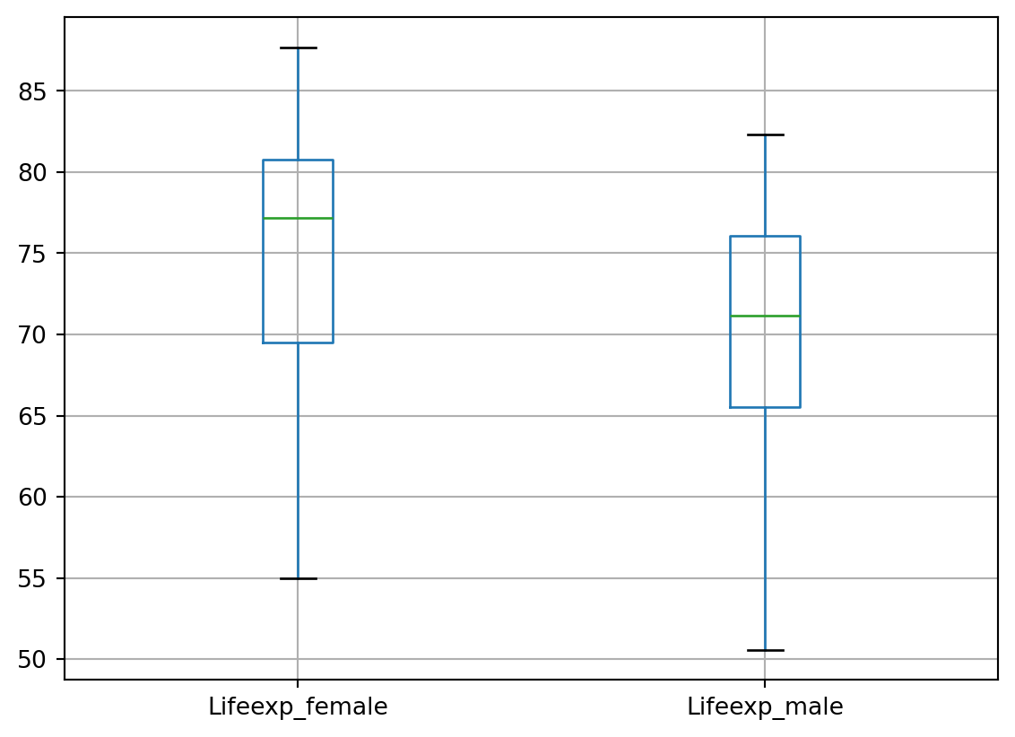
# Let's look at the distribution of values in terms of male and female life expectancy
df.boxplot(column=['Lifeexp_female', 'Lifeexp_male'])
# Let's look at the distribution of the Gross National Income (surely we expect to see outliers!)
df.boxplot(column=['GNI'])
# So, as expected, the world's wealth is not distributed evenly, but what countries are the outliers as Mary Rouncefield asked?
# We don't have the geographic coordinates as with our Hate Crime dataset to project on a map
# But perhaps we can think of other ways to get this information. Following is one way of doing this.

# Get the 25th and 75th percentile GNI values
GNI_quartiles = df['GNI'].describe()[['25%', '75%']]

# Calculate the IQR
IQR_GNI = GNI_quartiles['75%'] - GNI_quartiles['25%']

# Calculate the whiskers
lb_GNI = GNI_quartiles['25%'] - 1.5 * IQR_GNI
ub_GNI = GNI_quartiles['75%'] + 1.5 * IQR_GNI

# Retrieve the outliers
outliers_GNI_df = df[(df['GNI'] < lb_GNI) | (df['GNI'] > ub_GNI)]

# Get Country Codes for the outliers
outliers_GNI_countries = outliers_GNI_df['Country Code']
outliers_GNI_countries
85 HKG
92 IRL
115 LUX
116 MAC
146 NOR
158 QAT
170 SGP
187 CHE
203 ARE
205 USA
Name: Country Code, dtype: objectPerhaps you can checkout this link if you are doubtful about the country names and codes
# As with Part 1, let's standardise our data before we attempt further modelling using the data
from sklearn import preprocessing
import numpy as np
import seaborn as sns

# Get column names first
df_to_standardise = df[['birthrate', 'Deathrate', 'GNI', 'Lifeexp_female', 'Lifeexp_male', 'Neonatal_death']]
names = df_to_standardise.columns

# Create the Scaler object
scaler = preprocessing.StandardScaler()

# Fit our data on the scaler object
df2 = scaler.fit_transform(df_to_standardise)

# Check what type is df2? (Do you recollect this from Part 1?)
type(df2)numpy.ndarray# Let's convert the numpy array into a DataFrame before further processing
df2 = pd.DataFrame(df2, columns=names)
df2.tail()| birthrate | Deathrate | GNI | Lifeexp_female | Lifeexp_male | Neonatal_death | |
|---|---|---|---|---|---|---|
| 211 | -0.727171 | 0.200024 | NaN | 0.994355 | 0.807538 | NaN |
| 212 | 0.982566 | -1.563870 | -0.661830 | 0.051167 | 0.262031 | -0.233989 |
| 213 | 1.101866 | -0.604926 | NaN | -0.942333 | -0.798039 | 0.209120 |
| 214 | 1.686551 | -0.425077 | -0.813823 | -1.114030 | -1.323007 | 0.039069 |
| 215 | 1.124585 | 0.117514 | -0.840505 | -1.604284 | -1.462458 | -0.026205 |
# Now that our data has been standardised, let's look at the distribution across all columns
ax = sns.boxplot(data=df2, orient="h")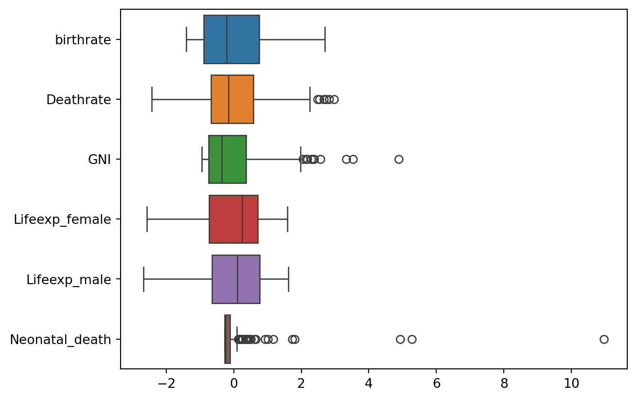
# There are clearly several outliers in some columns. Let's take a look at the numbers
df.describe()| birthrate | Deathrate | GNI | Lifeexp_female | Lifeexp_male | Neonatal_death | |
|---|---|---|---|---|---|---|
| count | 205.000000 | 205.000000 | 187.000000 | 198.000000 | 198.000000 | 193.000000 |
| mean | 19.637580 | 7.573941 | 20630.427807 | 75.193288 | 70.323854 | 12948.031088 |
| std | 9.839573 | 2.636414 | 21044.240160 | 7.870933 | 7.419214 | 48782.770706 |
| min | 5.900000 | 1.202000 | 780.000000 | 54.991000 | 50.582000 | 0.000000 |
| 25% | 10.900000 | 5.800000 | 5090.000000 | 69.497250 | 65.533500 | 163.000000 |
| 50% | 17.545000 | 7.163000 | 13280.000000 | 77.193000 | 71.140500 | 1288.000000 |
| 75% | 27.100000 | 9.100000 | 28360.000000 | 80.776500 | 76.047500 | 7316.000000 |
| max | 46.079000 | 15.400000 | 123290.000000 | 87.700000 | 82.300000 | 546427.000000 |
# Let's look at the histogram for birthrate
df[['birthrate']].plot(kind='hist', ec='black')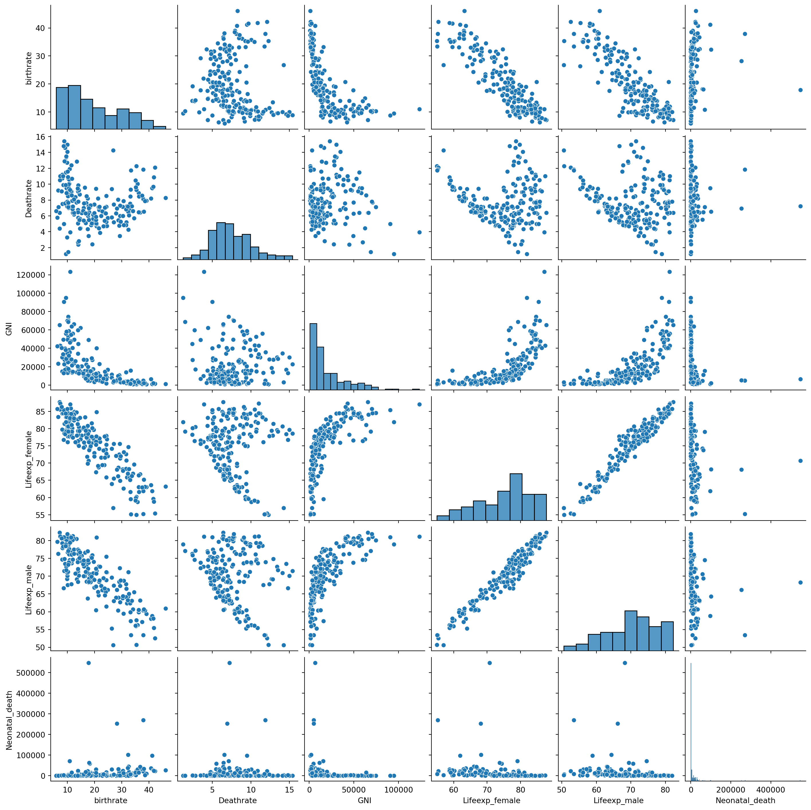
Tip for reflection: Is the above a unimodal or bimodal distribution? Positive or negative skew - We have worked on this in earlier labs. Try to recollect/revisit and reflect. Can we see/say any better with a kernel density plot?
# Let's create a pairwise plot as we have done many times before to get an idea about the relationship between variables
sns.pairplot(data = df.iloc[:,1:])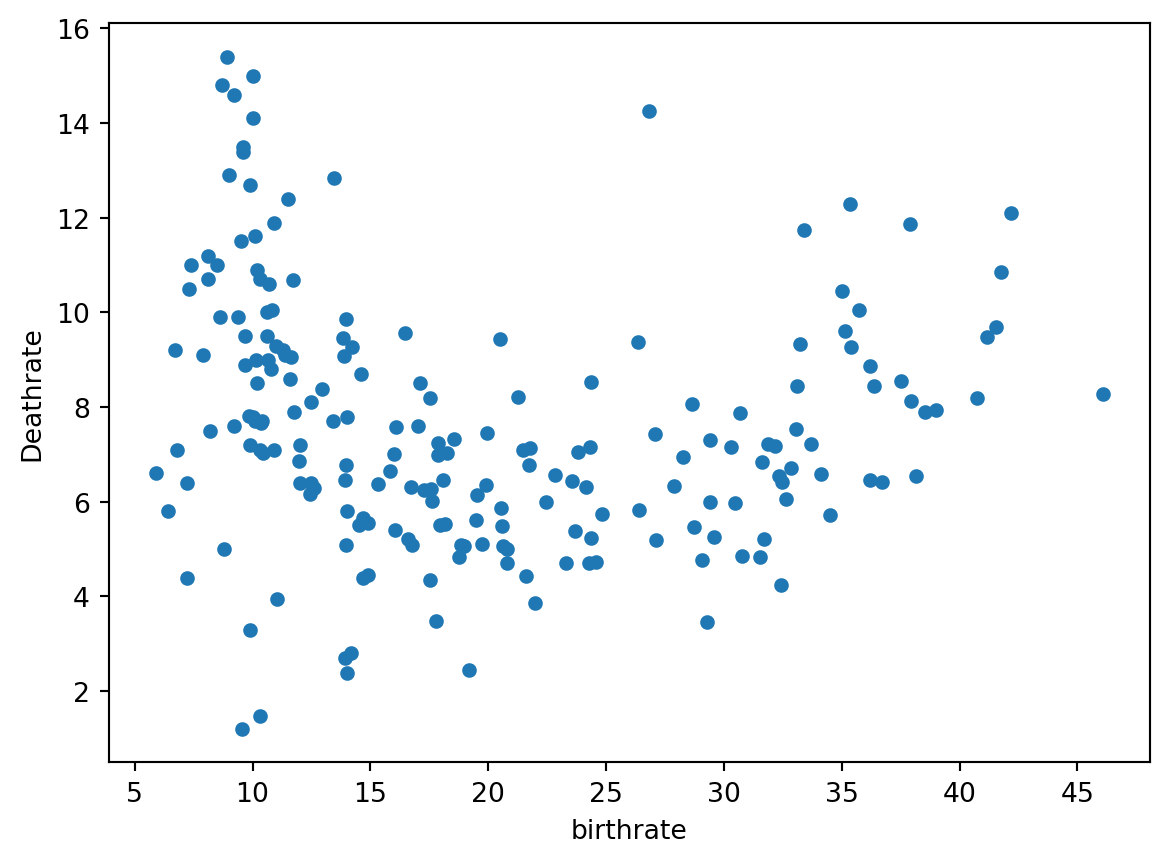
Hmmm, some likely positive and negative correlations
# Let's check the relationship between birthrate and deathrate
df.plot(x = 'birthrate', y = 'Deathrate', kind='scatter')
# Let's create a heatmap like we did in Part 1
corrMatrix = df.corr(numeric_only=True).round(1) # Again, round(1) so that it's easier to read given number of variables
sns.heatmap(corrMatrix, annot=True)
plt.show()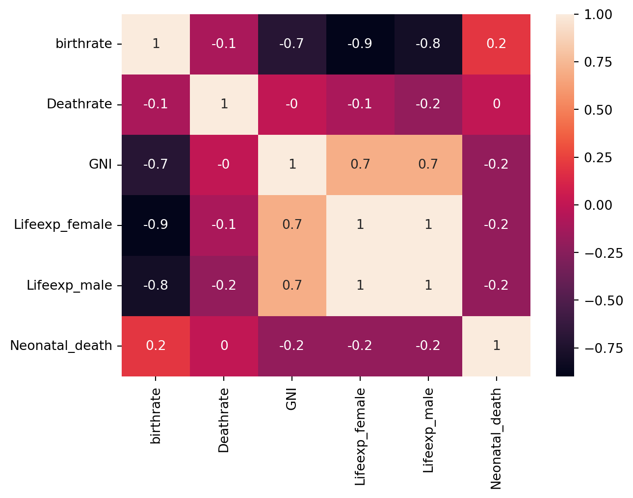
33.3 How quickly are populations growing?
This question can be investigated by calculating birth rate minus death rate.
# Let's add a new column to our DataFrame to indicate the rate of population change (assuming the absence of migration)
df['pop_change_rate'] = df['birthrate'] - df['Deathrate']
df.head()| Country Code | birthrate | Deathrate | GNI | Lifeexp_female | Lifeexp_male | Neonatal_death | pop_change_rate | |
|---|---|---|---|---|---|---|---|---|
| 0 | AFG | 32.487 | 6.423 | 2260.0 | 66.026 | 63.047 | 44503.0 | 26.064 |
| 1 | ALB | 11.780 | 7.898 | 13820.0 | 80.167 | 76.816 | 243.0 | 3.882 |
| 2 | DZA | 24.282 | 4.716 | 11450.0 | 77.938 | 75.494 | 16407.0 | 19.566 |
| 3 | AND | 7.200 | 4.400 | NaN | NaN | NaN | 1.0 | 2.800 |
| 4 | AGO | 40.729 | 8.190 | 6550.0 | 63.666 | 58.064 | 35489.0 | 32.539 |
# Let's look at the distribution of our new rate of population change column
df.boxplot(column=['pop_change_rate'])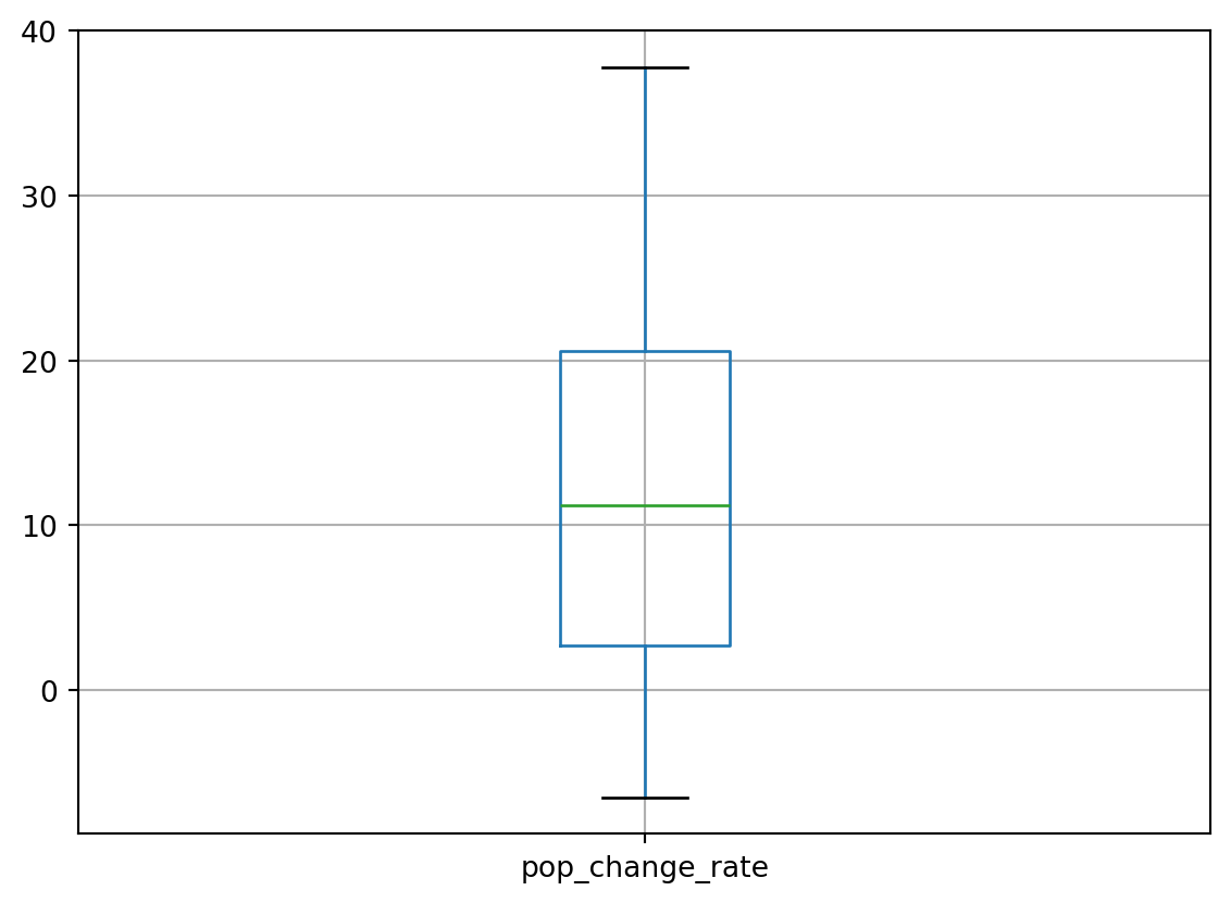
Let’s investigate the values in the column more deeply:
pop_change_rate_summary = df['pop_change_rate'].describe()
pop_change_rate_summary
count 205.000000
mean 12.063639
std 10.477867
min -6.500000
25% 2.700000
50% 11.213000
75% 20.582000
max 37.811000
Name: pop_change_rate, dtype: float64The results range from -6.5 (a decreasing population) to +37.811 (an increasing population). The mean is around 12.06. What does this signify?