One way to create potentially misleading visualisations is by manipulating the axes of a plot. Here we illustrate these using one of the FiveThirtyEight data sets, which are available here .
Data wrangling
We are going to use polls from the 2020 USA presidential election. As before, we load and examine the data.
import pandas as pd import seaborn as snsimport altair as alt = pd.read_csv('data/presidential_poll_averages_2020.csv' )
0
2020
Wyoming
11/3/2020
Joseph R. Biden Jr.
30.81486
30.82599
1
2020
Wisconsin
11/3/2020
Joseph R. Biden Jr.
52.12642
52.09584
2
2020
West Virginia
11/3/2020
Joseph R. Biden Jr.
33.49125
33.51517
3
2020
Washington
11/3/2020
Joseph R. Biden Jr.
59.34201
59.39408
4
2020
Virginia
11/3/2020
Joseph R. Biden Jr.
53.74120
53.72101
For our analysis, we are going to pick estimates from 11/3/2020 for the swing states of Florida, Texas, Arizona, Michigan, Minnesota and Pennsylvania.
= df_polls[== '11/3/2020' )= df_nov[== 'Joseph R. Biden Jr.' ) | == 'Donald Trump' )= df_nov['state' ] == 'Florida' ) | 'state' ] == 'Texas' ) | 'state' ] == 'Arizona' ) | 'state' ] == 'Michigan' ) | 'state' ] == 'Minnesota' ) | 'state' ] == 'Pennsylvania' )
7
2020
Texas
11/3/2020
Joseph R. Biden Jr.
47.46643
47.44781
12
2020
Pennsylvania
11/3/2020
Joseph R. Biden Jr.
50.22000
50.20422
30
2020
Minnesota
11/3/2020
Joseph R. Biden Jr.
51.86992
51.84517
31
2020
Michigan
11/3/2020
Joseph R. Biden Jr.
51.17806
51.15482
46
2020
Florida
11/3/2020
Joseph R. Biden Jr.
49.09162
49.08035
53
2020
Arizona
11/3/2020
Joseph R. Biden Jr.
48.72237
48.70539
63
2020
Texas
11/3/2020
Donald Trump
48.57118
48.58794
68
2020
Pennsylvania
11/3/2020
Donald Trump
45.57216
45.55034
86
2020
Minnesota
11/3/2020
Donald Trump
42.63638
42.66826
87
2020
Michigan
11/3/2020
Donald Trump
43.20577
43.23326
102
2020
Florida
11/3/2020
Donald Trump
46.68101
46.61909
109
2020
Arizona
11/3/2020
Donald Trump
46.11074
46.10181
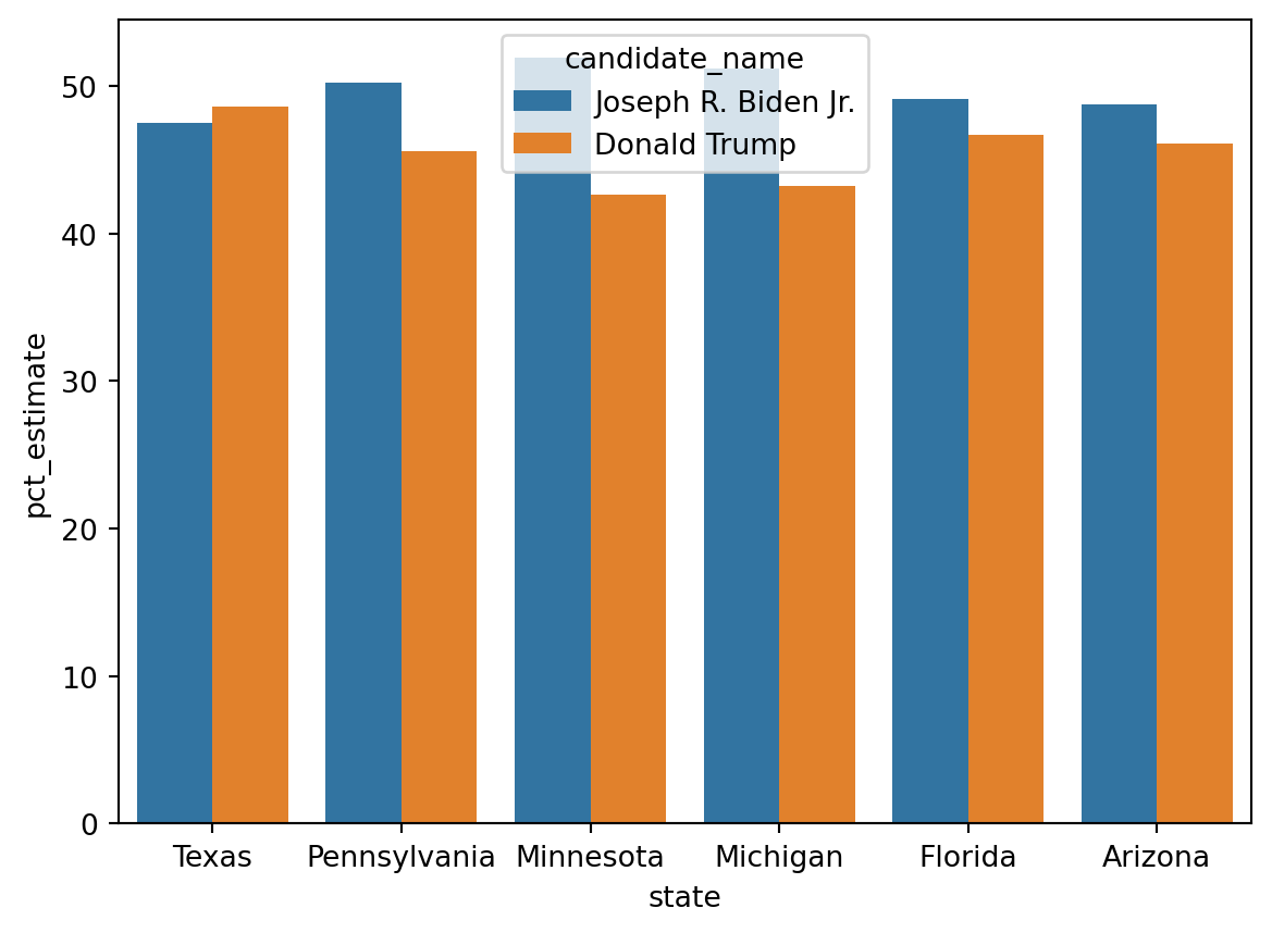
Default barplot
We can look at the relative performance of the candidates within each state using a nested bar plot.
= sns.barplot(= df_swing, = 'state' , = 'pct_estimate' , = 'candidate_name' )
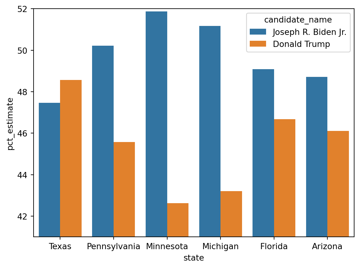
Altering the axes
Altering the axis increases the distance between the bars. Some might say that is misleading.
= sns.barplot(= df_swing, = 'state' , = 'pct_estimate' , = 'candidate_name' )set (ylim= (41 , 52 ))
What do you think?
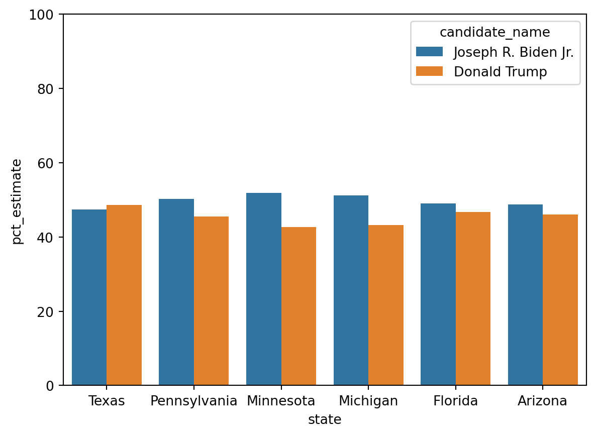
How about if we instead put the data on the full 0 to 100 scale?
= sns.barplot(= df_swing, = 'state' , = 'pct_estimate' , = 'candidate_name' )set (ylim= (0 , 100 ))
We can do the same thing in Altair.
= 'candidate_name' ,= 'pct_estimate' ,= 'candidate_name' ,= alt.Column('state:O' , spacing = 5 , header = alt.Header(labelOrient = "bottom" )),
Note the need for the alt column. What happens if you do not provide an alt column?
Passing the domain option to the scale of the Y axis allows us to choose the y axis range.
= True ).encode(= 'candidate_name' ,= alt.Y('pct_estimate' , scale= alt.Scale(domain= [42 ,53 ])),= 'candidate_name' ,= alt.Column('state:O' , spacing = 5 , header = alt.Header(labelOrient = "bottom" )),
Altering the proportions
We can even be a bit tricky and stretch out the difference.
= True ).encode(= 'candidate_name' ,= alt.Y('pct_estimate' , scale= alt.Scale(domain= [42 ,53 ])),= 'candidate_name' ,= alt.Column('state:O' , spacing = 5 , header = alt.Header(labelOrient = "bottom" )),= 20 ,= 600
Default line plot
It is not just bar plot that you can have fun with. Line plots are another interesting example.
For our simple line plot, we will need the poll data for a single state.
= df_polls['state' ] == 'Texas' = df_texas['candidate_name' ] == 'Donald Trump' ) | 'candidate_name' ] == 'Joseph R. Biden Jr.' )
7
2020
Texas
11/3/2020
Joseph R. Biden Jr.
47.46643
47.44781
63
2020
Texas
11/3/2020
Donald Trump
48.57118
48.58794
231
2020
Texas
11/2/2020
Joseph R. Biden Jr.
47.46643
47.44781
287
2020
Texas
11/2/2020
Donald Trump
48.57118
48.58794
455
2020
Texas
11/1/2020
Joseph R. Biden Jr.
47.45590
47.43400
The modeldate column is a string (object) and not date time. So we need to change that: we will create a new datetime column called date.
'date' ] = pd.to_datetime(df_texas_bt.loc[:,'modeldate' ], format = '%m/ %d /%Y' ).copy()
cycle                          int64
state                         object
modeldate                     object
candidate_name                object
pct_estimate                 float64
pct_trend_adjusted           float64
date                  datetime64[ns]
dtype: object
Create our line plot.
= alt.Y('pct_estimate' , scale= alt.Scale(domain= [42 ,53 ])),= 'date' ,= 'candidate_name' )
Sometimes multiple axis are used for each line, or in a combined line and bar plot.
The example here uses a dataframe with a column for each line. Our data does not have that.
= df_texas_bt[['candidate_name' , 'pct_estimate' , 'date' ]]
7
Joseph R. Biden Jr.
47.46643
2020-11-03
63
Donald Trump
48.57118
2020-11-03
231
Joseph R. Biden Jr.
47.46643
2020-11-02
287
Donald Trump
48.57118
2020-11-02
455
Joseph R. Biden Jr.
47.45590
2020-11-01
...
...
...
...
28931
Donald Trump
49.09724
2020-02-29
28963
Joseph R. Biden Jr.
45.30901
2020-02-28
28995
Donald Trump
49.09676
2020-02-28
29027
Joseph R. Biden Jr.
45.30089
2020-02-27
29058
Donald Trump
49.07925
2020-02-27
502 rows × 3 columns
Pivot table allows us to reshape our dataframe.
= pd.pivot_table(our_df, index= ['date' ], columns = 'candidate_name' )= our_df.columns.to_series().str .join('_' )
date
2020-02-27
49.07925
45.30089
2020-02-28
49.09676
45.30901
2020-02-29
49.09724
45.30896
2020-03-01
49.09724
45.30895
2020-03-02
48.91861
45.37694
Date here is the dataframe index. We want it to be a column.
'date1' ] = our_df.index= ['Trump' , 'Biden' , 'date1' ]
date
2020-02-27
49.07925
45.30089
2020-02-27
2020-02-28
49.09676
45.30901
2020-02-28
2020-02-29
49.09724
45.30896
2020-02-29
2020-03-01
49.09724
45.30895
2020-03-01
2020-03-02
48.91861
45.37694
2020-03-02
Creating our new plot, to fool all those people who expect Trump to win in Texas.
= alt.Chart(our_df).encode('date1' )= base.mark_line(color= '#5276A7' ).encode('Trump' , axis= alt.Axis(titleColor= '#5276A7' ), scale= alt.Scale(domain= [42 ,53 ]))= base.mark_line(color= '#F18727' ).encode('Biden' , axis= alt.Axis(titleColor= '#F18727' ), scale= alt.Scale(domain= [35 ,53 ]))= 'independent' )
Did you see what I did there?
Of course, mixed axis plots are rarely purely line plots. Instead they can be mixes of different axis. For these and other plotting mistakes, the economist has a nice article here . You may want to try some of these plots with this data set or the world indicators dataset from a few weeks ago.