In the following labs we are going to look at visualisations. In this notebook, we will consider 2 ‘illusions’, whereas the following ones will address misleading visualisations such as bar plots and line plots (Chapter 28) and choropleth maps.
Altair
For this lab we will be using Altair - a plotting library which has more flexibility than seaborn. It is a little more complex and examples can be found here. Altair is not installed by default in Anaconda, but it has been included in the virtual environment for this module. If you are using the course’s virtual environment, this should be installed for you the first time you set up your environment for the module. Refer to Appendix B for instructions on how to set up your environment.
27.1 Clustering illusion
The cluster illusion refers to the natural tendency to wrongly see patterns or clusters in random data. You can find details of the clustering illusion here, here, and here.
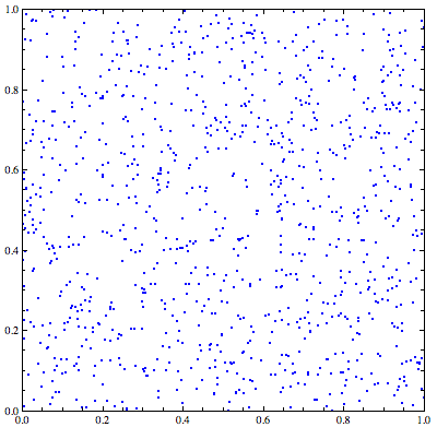
1,000 points randomly distributed inside a square, showing apparent clusters and empty spaces
We will try to replicate the image on the aside by generating a random dataset of 700 points with random x and y coordinates, and visualising them on a scatterplot to see if we can see any false clustering:
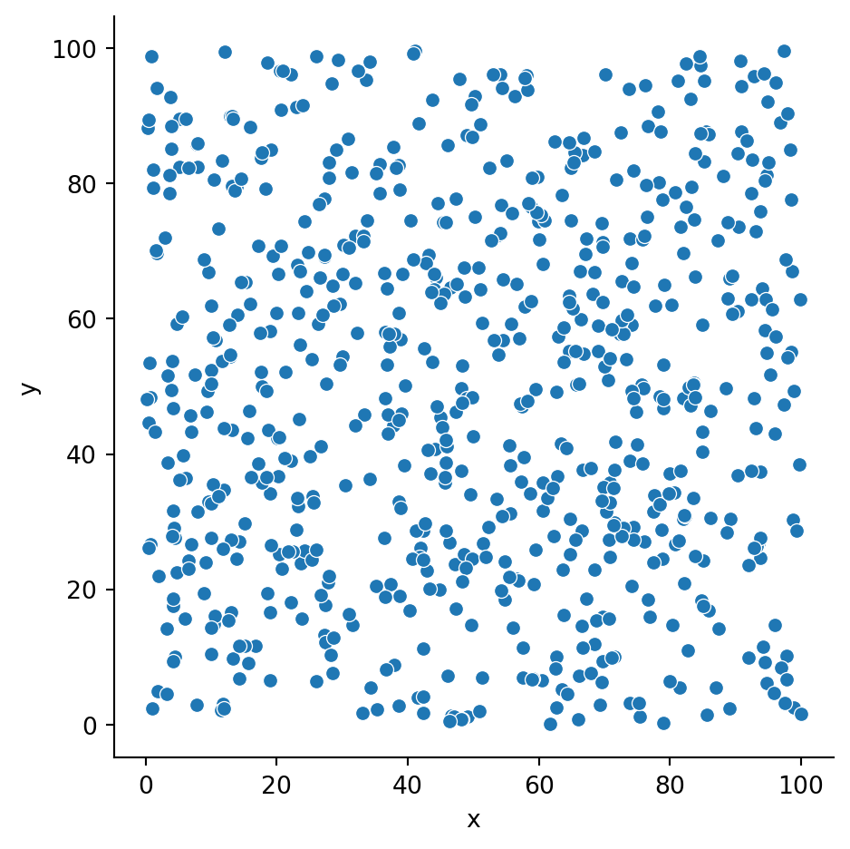
import numpy as npimport seaborn as snsimport pandas as pdimport altair as alt# Set number of observations in the dataframe that we are about to create.n =700# Generate a random dataframe.d = {'x': np.random.uniform(0, 100, n), 'y': np.random.uniform(0, 100, n)}df = pd.DataFrame(d)# Create a scatterplot with seaborn.sns.relplot(data = df, x ='x', y ='y')
And now the same but using altair instead of seaborn. The syntax for building this type in Altair is pretty straight forward.
# Basic scatterplot in Altairalt.Chart(df).mark_circle(size=5).encode( x='x', y='y')
To remove those pesky lines we need to specify we want an x and y axis without grid lines.
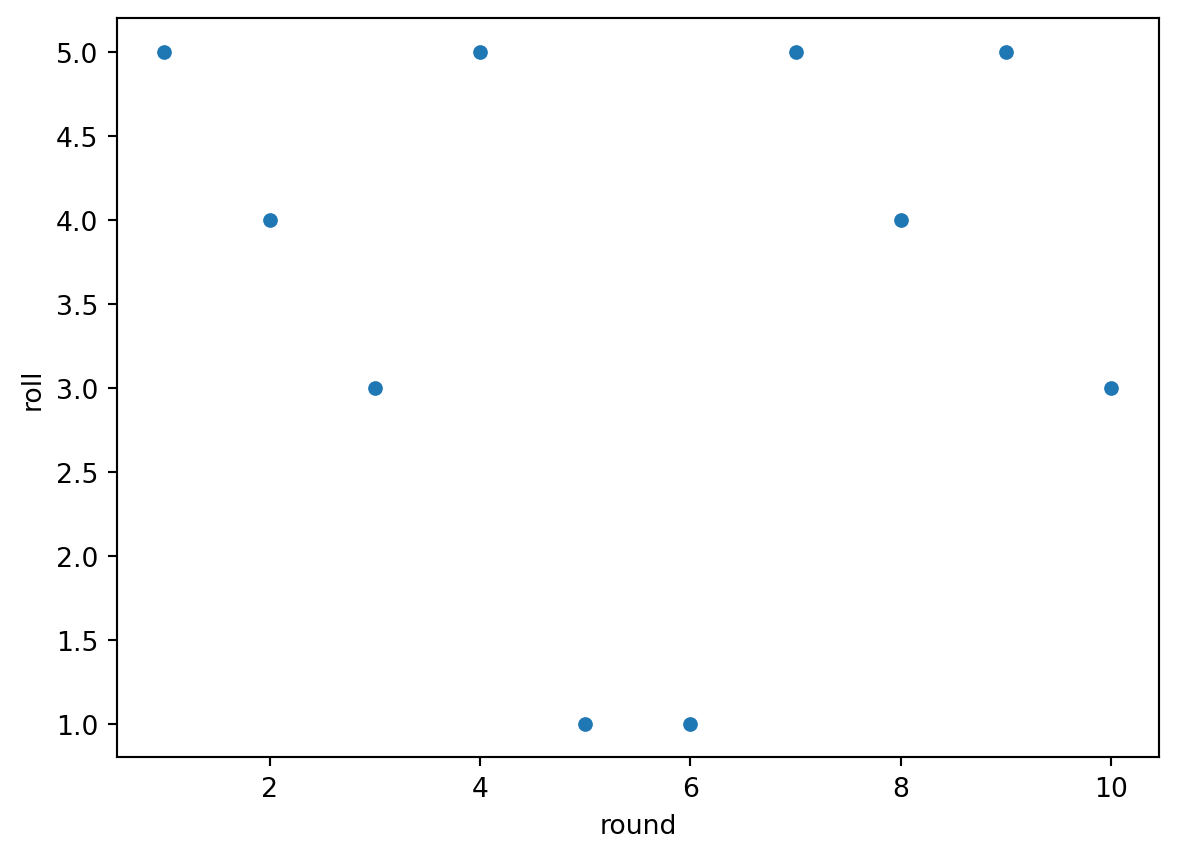
Another example of the clustering illusion is the idea of ‘streaks’, which consists of (wrongly) identifying a pattern from a small sample and extrapolate out.
Let’s imagine you roll a dice. What are the odds of it being 6? And if we do a second roll? And a third? And if we repeat it 10 times? Or conversely, would you be able to predict what the next dice roll would be after 10 attemtps?
Let’s figure it out!
n_rolls =10# Generate a dataframe where we randomly get a number from 1-6 per n rounds.d = {'round': np.linspace(1,n_rolls,n_rolls), 'roll': np.random.randint(1,7,n_rolls)}df_dice = pd.DataFrame(d)df_dice
Each number on the dice will occur the same number of times. Any patterns you see are due to extrapolating based on a small sample. We can check that though by rolling the ‘dice’ 1,000,000 times.
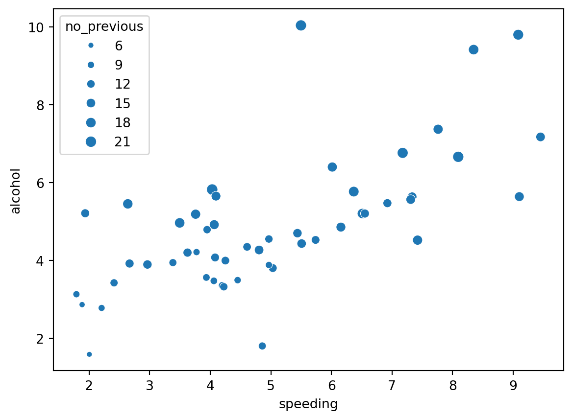
‘The Weber-Fechner Law is a famous finding of early psychophysics indicating that differences between stimuli are detected on a logarithmic scale. It takes more additional millimeters of radius to discern two larger circles than two smaller circles. This type of bias is probably one of the most researched biases in visualization research.’
To illustrate this ‘illusion’ we will plot the percentage of drivers speeding, percentage of alcohol impaired and set the size of the point equal to the percentage of drivers not previously involves in any accident. Each point is an american state.
Are there any relationships or patterns in the data?
Have you come across any other illusions? If so, try and plot them out. I sometimes find it easier to understand these things through creating simple illustrations of my own.
Calero Valdez, André, Martina Ziefle, and Michael Sedlmair. 2018. “Studying Biases in VisualizationResearch: Framework and Methods.” In Cognitive Biases in Visualizations, edited by Geoffrey Ellis, 13–27. Cham: Springer International Publishing. https://doi.org/10.1007/978-3-319-95831-6_2.