import pandas as pd
df = pd.read_excel('data/hate_Crimes_v2.xlsx')32 Lab: Hate crimes
In the session 7 (week 8) we discussed data and society: discourses on the social, political and ethical aspects of data science. We also discussed how one can responsibly carry out data science research on social phenomena, what ethical and social frameworks can help us to critically approach data science practices and its effects on society, and about ethical practices for data scientists.
32.1 Datasets
This week we will work with the following datasets:
- Hate crimes
- World Bank Indicators Dataset
- Office for National Statistics (ONS): Gender Pay Gap
32.1.1 Further datasets
- OECD Poverty gap
- Poverty & Equity Data Portal: From Organisation for Economic Co-operation and Development (OECD) or from the WorldBank
- NHS: multiple files. The NHS inequality challenge https://www.nuffieldtrust.org.uk/project/nhs-visual-data-challenge
- Health state life expectancies by Index of Multiple Deprivation (IMD 2015 and IMD 2019): England, all ages multiple publications
32.1.2 Additional Readings
- Indicators - critical reviews: The Poverty of Statistics and the Statistics of Poverty: https://www.tandfonline.com/doi/full/10.1080/01436590903321844?src=recsys
- Indicators in global health: arguments: indicators are usually comprehensible to a small group of experts. Why use indicators then? “Because indicators used in global HIV finance offer openings for engagement to promote accountability (…) some indicators and data truly are better than others, and as they were all created by humans, they all can be deconstructed and remade in other forms” Davis, S. (2020). The Uncounted: Politics of Data in Global Health, Cambridge. doi:10.1017/9781108649544
32.2 Hate Crimes
In this notebook we will be using the Hate Crimes dataset from Fivethirtyeight, which was used in the story Higher Rates Of Hate Crimes Are Tied To Income Inequality.
32.2.1 Variables:
| Header | Definition |
|---|---|
NAME |
State name |
median_household_income |
Median household income, 2016 |
share_unemployed_seasonal |
Share of the population that is unemployed (seasonally adjusted), Sept. 2016 |
share_population_in_metro_areas |
Share of the population that lives in metropolitan areas, 2015 |
share_population_with_high_school_degree |
Share of adults 25 and older with a high-school degree, 2009 |
share_non_citizen |
Share of the population that are not U.S. citizens, 2015 |
share_white_poverty |
Share of white residents who are living in poverty, 2015 |
gini_index |
Gini Index, 2015 |
share_non_white |
Share of the population that is not white, 2015 |
share_voters_voted_trump |
Share of 2016 U.S. presidential voters who voted for Donald Trump |
hate_crimes_per_100k_splc |
Hate crimes per 100,000 population, Southern Poverty Law Center, Nov. 9-18, 2016 |
avg_hatecrimes_per_100k_fbi |
Average annual hate crimes per 100,000 population, FBI, 2010-2015 |
Gini Index: measures income inequality. Gini Index values can range between 0 and 1, where 0 indicates perfect equality and everyone has the same income, and 1 indicates perfect inequality. You can read more about Gini Index here: https://databank.worldbank.org/metadataglossary/world-development-indicators/series/SI.POV.GINI
.png)
32.3 Data exploration
Select the IM939 environment before you begin
We will again be using Altair and Geopandas this week. If you are using the course’s virtual environment, this should be installed for you the first time you set up your environment for the module. Refer to Appendix B for instructions on how to set up your environment.
A reminder: anything with a pd. prefix comes from pandas (since pd is the alias we have created for the pandas library). This is particulary useful for preventing a module from overwriting inbuilt Python functionality.
Let’s have a look at our dataset
# Retrieve the last ten rows of the df dataframe
df.tail(10)| NAME | median_household_income | share_unemployed_seasonal | share_population_in_metro_areas | share_population_with_high_school_degree | share_non_citizen | share_white_poverty | gini_index | share_non_white | share_voters_voted_trump | hate_crimes_per_100k_splc | avg_hatecrimes_per_100k_fbi | |
|---|---|---|---|---|---|---|---|---|---|---|---|---|
| 41 | South Dakota | 53053 | 0.035 | 0.51 | 0.899 | NaN | 0.08 | 0.442 | 0.17 | 0.62 | 0.00 | 3.30 |
| 42 | Tennessee | 43716 | 0.057 | 0.82 | 0.831 | 0.04 | 0.13 | 0.468 | 0.27 | 0.61 | 0.19 | 3.13 |
| 43 | Texas | 53875 | 0.042 | 0.92 | 0.799 | 0.11 | 0.08 | 0.469 | 0.56 | 0.53 | 0.21 | 0.75 |
| 44 | Utah | 63383 | 0.036 | 0.82 | 0.904 | 0.04 | 0.08 | 0.419 | 0.19 | 0.47 | 0.13 | 2.38 |
| 45 | Vermont | 60708 | 0.037 | 0.35 | 0.910 | 0.01 | 0.10 | 0.444 | 0.06 | 0.33 | 0.32 | 1.90 |
| 46 | Virginia | 66155 | 0.043 | 0.89 | 0.866 | 0.06 | 0.07 | 0.459 | 0.38 | 0.45 | 0.36 | 1.72 |
| 47 | Washington | 59068 | 0.052 | 0.86 | 0.897 | 0.08 | 0.09 | 0.441 | 0.31 | 0.38 | 0.67 | 3.81 |
| 48 | West Virginia | 39552 | 0.073 | 0.55 | 0.828 | 0.01 | 0.14 | 0.451 | 0.07 | 0.69 | 0.32 | 2.03 |
| 49 | Wisconsin | 58080 | 0.043 | 0.69 | 0.898 | 0.03 | 0.09 | 0.430 | 0.22 | 0.48 | 0.22 | 1.12 |
| 50 | Wyoming | 55690 | 0.040 | 0.31 | 0.918 | 0.02 | 0.09 | 0.423 | 0.15 | 0.70 | 0.00 | 0.26 |
# Is df indeed a DataFrame, let's do a quick check
type(df)pandas.core.frame.DataFrame# What about the data type (Dtype) of the columns in df. We better also be aware of these to help us understand about manipulating them effectively
df.info()<class 'pandas.core.frame.DataFrame'>
RangeIndex: 51 entries, 0 to 50
Data columns (total 12 columns):
# Column Non-Null Count Dtype
--- ------ -------------- -----
0 NAME 51 non-null object
1 median_household_income 51 non-null int64
2 share_unemployed_seasonal 51 non-null float64
3 share_population_in_metro_areas 51 non-null float64
4 share_population_with_high_school_degree 51 non-null float64
5 share_non_citizen 48 non-null float64
6 share_white_poverty 51 non-null float64
7 gini_index 51 non-null float64
8 share_non_white 51 non-null float64
9 share_voters_voted_trump 51 non-null float64
10 hate_crimes_per_100k_splc 51 non-null float64
11 avg_hatecrimes_per_100k_fbi 51 non-null float64
dtypes: float64(10), int64(1), object(1)
memory usage: 4.9+ KB32.3.1 Missing values
Let’s explore the dataset
The output above shows that we have some missing data for some of the states, as also shown by df.tail(10) earlier on. Let’s check again.
df.isna().sum()NAME 0
median_household_income 0
share_unemployed_seasonal 0
share_population_in_metro_areas 0
share_population_with_high_school_degree 0
share_non_citizen 3
share_white_poverty 0
gini_index 0
share_non_white 0
share_voters_voted_trump 0
hate_crimes_per_100k_splc 0
avg_hatecrimes_per_100k_fbi 0
dtype: int64Hmmm, the column ‘share_non_citizen’ does indeed have some missing data. How about the column NAME (state names). Is that looking ok?
import numpy as np
np.unique(df.NAME)array(['Alabama', 'Alaska', 'Arizona', 'Arkansas', 'California',
'Colorado', 'Connecticut', 'Delaware', 'District of Columbia',
'Florida', 'Georgia', 'Hawaii', 'Idaho', 'Illinois', 'Indiana',
'Iowa', 'Kansas', 'Kentucky', 'Louisiana', 'Maine', 'Maryland',
'Massachusetts', 'Michigan', 'Minnesota', 'Mississippi',
'Missouri', 'Montana', 'Nebraska', 'Nevada', 'New Hampshire',
'New Jersey', 'New Mexico', 'New York', 'North Carolina',
'North Dakota', 'Ohio', 'Oklahoma', 'Oregon', 'Pennsylvania',
'Rhode Island', 'South Carolina', 'South Dakota', 'Tennessee',
'Texas', 'Utah', 'Vermont', 'Virginia', 'Washington',
'West Virginia', 'Wisconsin', 'Wyoming'], dtype=object)There aren’t any unexpected values in ‘NAME’ for the USA
# And how many states do we have the data for?
count_states = df['NAME'].nunique()
print(count_states)51Oh…one extra state! Which one is it? And is it a state? Even if you don’t get into investigating this immediately, if you realise that this entry is a particularly interesting one down the line in your analysis, you may wish to dig deeper into the context!
32.4 Mapping hate crime across the USA
# We need the geospatial polygons of the states in America
# You can remind yourself about shape polygons from the lab material last week too
import geopandas as gpd
import altair as alt
# Read geospatial data as geospatial data frame -gdf
gdf = gpd.read_file('data/gz_2010_us_040_00_500k.json')
gdf.head()| GEO_ID | STATE | NAME | LSAD | CENSUSAREA | geometry | |
|---|---|---|---|---|---|---|
| 0 | 0400000US23 | 23 | Maine | 30842.923 | MULTIPOLYGON (((-67.61976 44.51975, -67.61541 ... | |
| 1 | 0400000US25 | 25 | Massachusetts | 7800.058 | MULTIPOLYGON (((-70.83204 41.6065, -70.82374 4... | |
| 2 | 0400000US26 | 26 | Michigan | 56538.901 | MULTIPOLYGON (((-88.68443 48.11578, -88.67563 ... | |
| 3 | 0400000US30 | 30 | Montana | 145545.801 | POLYGON ((-104.0577 44.99743, -104.25014 44.99... | |
| 4 | 0400000US32 | 32 | Nevada | 109781.180 | POLYGON ((-114.0506 37.0004, -114.05 36.95777,... |
# Confirm what type geo_states is...
type(gdf)geopandas.geodataframe.GeoDataFrameAs with the previous week, we have got a column called geometry that would allow us to project the data in a 2D map format.
# Calling the Altair alias (alt) to help us create the map of USA - more technically speaking,
# creating a Chart object using Altair with the following properties
alt.Chart(gdf, title='US states').mark_geoshape().encode(
).properties(
width=500,
height=300
).project(
type='albersUsa'
)# Add the data
# You might recall that the df DataFrame and the geostates GeoDataFrame both have a NAME column
# Revisit the merge concept again (from last week and earlier weeks to refresh your memory)
geo_states = gdf.merge(df, on='NAME')
geo_states.head()| GEO_ID | STATE | NAME | LSAD | CENSUSAREA | geometry | median_household_income | share_unemployed_seasonal | share_population_in_metro_areas | share_population_with_high_school_degree | share_non_citizen | share_white_poverty | gini_index | share_non_white | share_voters_voted_trump | hate_crimes_per_100k_splc | avg_hatecrimes_per_100k_fbi | |
|---|---|---|---|---|---|---|---|---|---|---|---|---|---|---|---|---|---|
| 0 | 0400000US23 | 23 | Maine | 30842.923 | MULTIPOLYGON (((-67.61976 44.51975, -67.61541 ... | 51710 | 0.044 | 0.54 | 0.902 | NaN | 0.12 | 0.437 | 0.09 | 0.45 | 0.61 | 2.62 | |
| 1 | 0400000US25 | 25 | Massachusetts | 7800.058 | MULTIPOLYGON (((-70.83204 41.6065, -70.82374 4... | 63151 | 0.046 | 0.97 | 0.890 | 0.09 | 0.08 | 0.475 | 0.27 | 0.34 | 0.63 | 4.80 | |
| 2 | 0400000US26 | 26 | Michigan | 56538.901 | MULTIPOLYGON (((-88.68443 48.11578, -88.67563 ... | 52005 | 0.050 | 0.87 | 0.879 | 0.04 | 0.09 | 0.451 | 0.24 | 0.48 | 0.40 | 3.20 | |
| 3 | 0400000US30 | 30 | Montana | 145545.801 | POLYGON ((-104.0577 44.99743, -104.25014 44.99... | 51102 | 0.041 | 0.34 | 0.908 | 0.01 | 0.10 | 0.435 | 0.10 | 0.57 | 0.49 | 2.95 | |
| 4 | 0400000US32 | 32 | Nevada | 109781.180 | POLYGON ((-114.0506 37.0004, -114.05 36.95777,... | 49875 | 0.067 | 0.87 | 0.839 | 0.10 | 0.08 | 0.448 | 0.50 | 0.46 | 0.14 | 2.11 |
# Let's take a look at the merged GeoDataFrame
geo_states.head(10)| GEO_ID | STATE | NAME | LSAD | CENSUSAREA | geometry | median_household_income | share_unemployed_seasonal | share_population_in_metro_areas | share_population_with_high_school_degree | share_non_citizen | share_white_poverty | gini_index | share_non_white | share_voters_voted_trump | hate_crimes_per_100k_splc | avg_hatecrimes_per_100k_fbi | |
|---|---|---|---|---|---|---|---|---|---|---|---|---|---|---|---|---|---|
| 0 | 0400000US23 | 23 | Maine | 30842.923 | MULTIPOLYGON (((-67.61976 44.51975, -67.61541 ... | 51710 | 0.044 | 0.54 | 0.902 | NaN | 0.12 | 0.437 | 0.09 | 0.45 | 0.61 | 2.62 | |
| 1 | 0400000US25 | 25 | Massachusetts | 7800.058 | MULTIPOLYGON (((-70.83204 41.6065, -70.82374 4... | 63151 | 0.046 | 0.97 | 0.890 | 0.09 | 0.08 | 0.475 | 0.27 | 0.34 | 0.63 | 4.80 | |
| 2 | 0400000US26 | 26 | Michigan | 56538.901 | MULTIPOLYGON (((-88.68443 48.11578, -88.67563 ... | 52005 | 0.050 | 0.87 | 0.879 | 0.04 | 0.09 | 0.451 | 0.24 | 0.48 | 0.40 | 3.20 | |
| 3 | 0400000US30 | 30 | Montana | 145545.801 | POLYGON ((-104.0577 44.99743, -104.25014 44.99... | 51102 | 0.041 | 0.34 | 0.908 | 0.01 | 0.10 | 0.435 | 0.10 | 0.57 | 0.49 | 2.95 | |
| 4 | 0400000US32 | 32 | Nevada | 109781.180 | POLYGON ((-114.0506 37.0004, -114.05 36.95777,... | 49875 | 0.067 | 0.87 | 0.839 | 0.10 | 0.08 | 0.448 | 0.50 | 0.46 | 0.14 | 2.11 | |
| 5 | 0400000US34 | 34 | New Jersey | 7354.220 | POLYGON ((-75.52684 39.65571, -75.52634 39.656... | 65243 | 0.056 | 1.00 | 0.874 | 0.11 | 0.07 | 0.464 | 0.44 | 0.42 | 0.07 | 4.41 | |
| 6 | 0400000US36 | 36 | New York | 47126.399 | MULTIPOLYGON (((-71.94356 41.28668, -71.9268 4... | 54310 | 0.051 | 0.94 | 0.847 | 0.10 | 0.10 | 0.499 | 0.42 | 0.37 | 0.35 | 3.10 | |
| 7 | 0400000US37 | 37 | North Carolina | 48617.905 | MULTIPOLYGON (((-82.60288 36.03983, -82.60074 ... | 46784 | 0.058 | 0.76 | 0.843 | 0.05 | 0.10 | 0.464 | 0.38 | 0.51 | 0.24 | 1.26 | |
| 8 | 0400000US39 | 39 | Ohio | 40860.694 | MULTIPOLYGON (((-82.81349 41.72347, -82.81049 ... | 49644 | 0.045 | 0.75 | 0.876 | 0.03 | 0.10 | 0.452 | 0.21 | 0.52 | 0.19 | 3.24 | |
| 9 | 0400000US42 | 42 | Pennsylvania | 44742.703 | POLYGON ((-75.41504 39.80179, -75.42804 39.809... | 55173 | 0.053 | 0.87 | 0.879 | 0.03 | 0.09 | 0.461 | 0.24 | 0.49 | 0.28 | 0.43 |
Let’s start making our visualisations and see if we can spot any trends or patterns
# Let's first check how hate crimes looked pre-election
chart_pre_election = alt.Chart(geo_states, title='PRE-election Hate crime per 100k').mark_geoshape().encode(
color='avg_hatecrimes_per_100k_fbi',
tooltip=['NAME', 'avg_hatecrimes_per_100k_fbi']
).properties(
width=500,
height=300
).project(
type='albersUsa'
)
chart_pre_electionAs you can see above, Altair has chosen a color for each US state based on the range of values in the avg_hatecrimes_per_100k_fbi column. We have also created a tooltip, so hover over the map and check the crime rates. Which ones are particularly high? average? low?
Also, is there a dark spot between Virginia and Maryland - Did you notice that? What’s happening there? Remember: Context always matters for data analysis!
# Ok, what about the post election status?
chart_post_election = alt.Chart(geo_states, title='POST-election Hate crime per 100k').mark_geoshape().encode(
color='hate_crimes_per_100k_splc',
tooltip=['NAME', 'hate_crimes_per_100k_splc']
).properties(
width=500,
height=300
).project(
type='albersUsa'
)
chart_post_election# Perhaps we can arrange the maps side-by-side to compare better?
pre_and_post_map = chart_pre_election | chart_post_election
pre_and_post_map
Note
Oh, what’s happening here? We better investigate:
Identify why the maps (particularly) one of them looks so different now. Go back to the original maps to check. Go back to the description of the variables to check. Also, visit the source of the article.
Once you have identified the issue, can you find a way to address the issue?
32.4.1 Exploring data
import seaborn as sns
sns.pairplot(data = df.iloc[:,1:])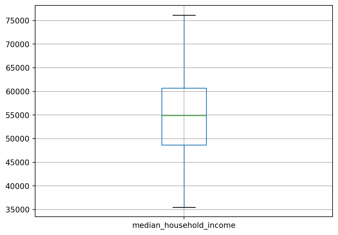
The above plot may be hard to read without squinting our eyes (and take a bit longer to run on some devices), but it’s definitely worth a closer look if you are able to. Check the histograms along the diagonal - what do they show about the distribution of each variable. For example, what does the gini_index distribution tell us? With respect to the scatter plots, some are more random while others show likely positive or negative correlations. You may wish to investigate what’s happening! And, you might remember (as we also discussed in the video recordings this week), correlation != causation!
# Let's take a look at the income range in the country
df.boxplot(column=['median_household_income'])
# And the average hatecrimes based on FBI data next (also, average over what? check the Variables description again to remind you if need be)
df.boxplot(column=['avg_hatecrimes_per_100k_fbi'])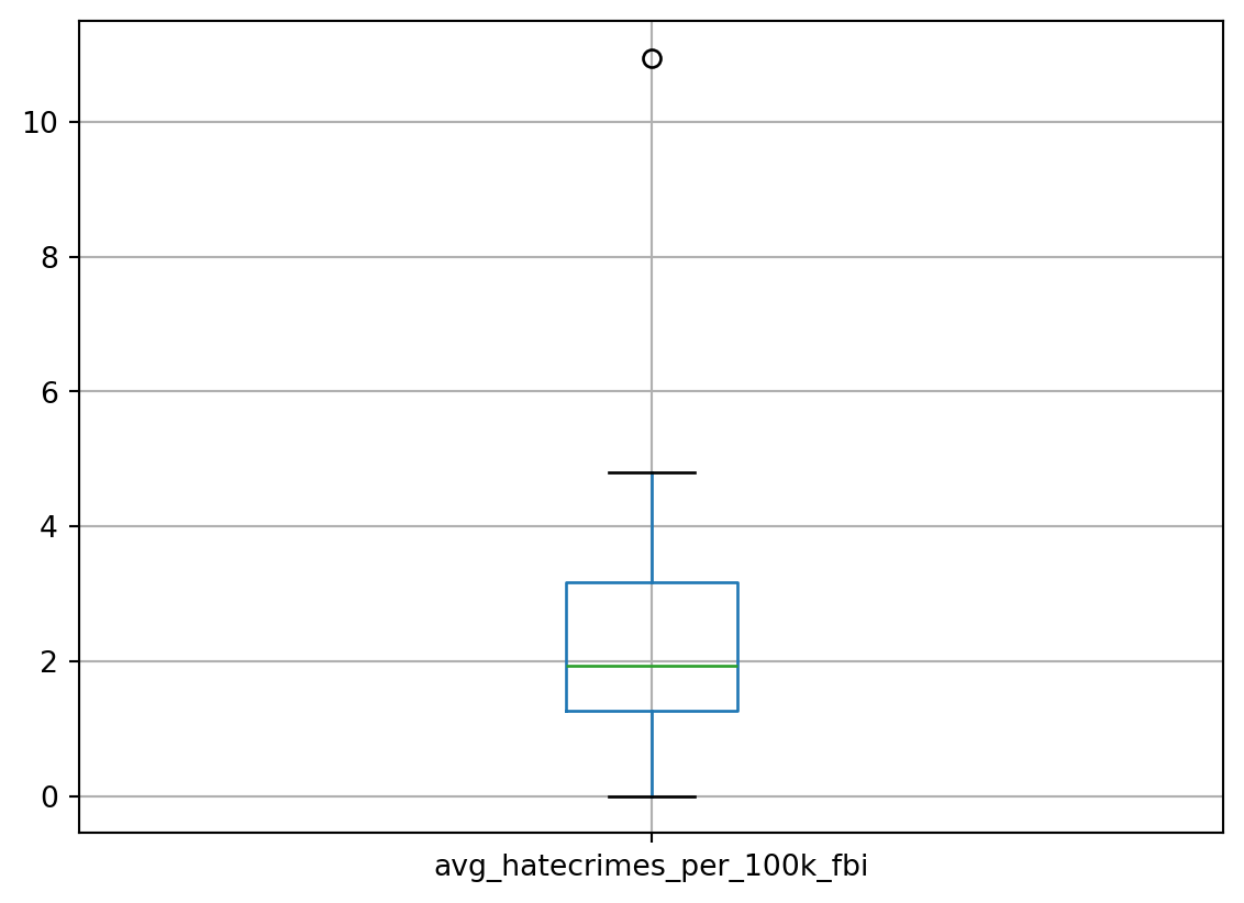
We may want to drop some states (remove them). See more here.
Let us drop Hawaii (which is one of the states outside mainland USA)
# Let's find out the index value of the state in the DataFrame df
df[df.NAME == 'Hawaii']| NAME | median_household_income | share_unemployed_seasonal | share_population_in_metro_areas | share_population_with_high_school_degree | share_non_citizen | share_white_poverty | gini_index | share_non_white | share_voters_voted_trump | hate_crimes_per_100k_splc | avg_hatecrimes_per_100k_fbi | |
|---|---|---|---|---|---|---|---|---|---|---|---|---|
| 11 | Hawaii | 71223 | 0.034 | 0.76 | 0.904 | 0.08 | 0.07 | 0.433 | 0.81 | 0.3 | 0.0 | 0.0 |
# Let's look at a summary of numeric columns prior to dropping Hawaii
df.describe()| median_household_income | share_unemployed_seasonal | share_population_in_metro_areas | share_population_with_high_school_degree | share_non_citizen | share_white_poverty | gini_index | share_non_white | share_voters_voted_trump | hate_crimes_per_100k_splc | avg_hatecrimes_per_100k_fbi | |
|---|---|---|---|---|---|---|---|---|---|---|---|
| count | 51.000000 | 51.000000 | 51.000000 | 51.000000 | 48.000000 | 51.000000 | 51.000000 | 51.000000 | 51.00000 | 51.000000 | 51.000000 |
| mean | 55223.607843 | 0.049569 | 0.750196 | 0.869118 | 0.054583 | 0.091765 | 0.453765 | 0.315686 | 0.49000 | 0.275686 | 2.316863 |
| std | 9208.478170 | 0.010698 | 0.181587 | 0.034073 | 0.031077 | 0.024715 | 0.020891 | 0.164915 | 0.11871 | 0.256252 | 1.729228 |
| min | 35521.000000 | 0.028000 | 0.310000 | 0.799000 | 0.010000 | 0.040000 | 0.419000 | 0.060000 | 0.04000 | 0.000000 | 0.000000 |
| 25% | 48657.000000 | 0.042000 | 0.630000 | 0.840500 | 0.030000 | 0.075000 | 0.440000 | 0.195000 | 0.41500 | 0.125000 | 1.270000 |
| 50% | 54916.000000 | 0.051000 | 0.790000 | 0.874000 | 0.045000 | 0.090000 | 0.454000 | 0.280000 | 0.49000 | 0.210000 | 1.930000 |
| 75% | 60719.000000 | 0.057500 | 0.895000 | 0.898000 | 0.080000 | 0.100000 | 0.466500 | 0.420000 | 0.57500 | 0.340000 | 3.165000 |
| max | 76165.000000 | 0.073000 | 1.000000 | 0.918000 | 0.130000 | 0.170000 | 0.532000 | 0.810000 | 0.70000 | 1.520000 | 10.950000 |
# Let's now drop Hawaii
df = df.drop(df.index[11])# Now check again for the statistical summary
df.describe()| median_household_income | share_unemployed_seasonal | share_population_in_metro_areas | share_population_with_high_school_degree | share_non_citizen | share_white_poverty | gini_index | share_non_white | share_voters_voted_trump | hate_crimes_per_100k_splc | avg_hatecrimes_per_100k_fbi | |
|---|---|---|---|---|---|---|---|---|---|---|---|
| count | 50.000000 | 50.000000 | 50.000000 | 50.000000 | 47.000000 | 50.000000 | 50.000000 | 50.000000 | 50.00000 | 50.000000 | 50.000000 |
| mean | 54903.620000 | 0.049880 | 0.750000 | 0.868420 | 0.054043 | 0.092200 | 0.454180 | 0.305800 | 0.49380 | 0.281200 | 2.363200 |
| std | 9010.994814 | 0.010571 | 0.183425 | 0.034049 | 0.031184 | 0.024767 | 0.020889 | 0.150551 | 0.11674 | 0.255779 | 1.714502 |
| min | 35521.000000 | 0.028000 | 0.310000 | 0.799000 | 0.010000 | 0.040000 | 0.419000 | 0.060000 | 0.04000 | 0.000000 | 0.260000 |
| 25% | 48358.500000 | 0.042250 | 0.630000 | 0.839750 | 0.030000 | 0.080000 | 0.440000 | 0.192500 | 0.42000 | 0.130000 | 1.290000 |
| 50% | 54613.000000 | 0.051000 | 0.790000 | 0.874000 | 0.040000 | 0.090000 | 0.454500 | 0.275000 | 0.49500 | 0.215000 | 1.980000 |
| 75% | 60652.750000 | 0.057750 | 0.897500 | 0.897750 | 0.080000 | 0.100000 | 0.466750 | 0.420000 | 0.57750 | 0.345000 | 3.182500 |
| max | 76165.000000 | 0.073000 | 1.000000 | 0.918000 | 0.130000 | 0.170000 | 0.532000 | 0.630000 | 0.70000 | 1.520000 | 10.950000 |
There seems to be some changes.
# Let's dig in deeper to the correlation between median household income and hatecrimes based on FBI data
df.plot(x = 'avg_hatecrimes_per_100k_fbi', y = 'median_household_income', kind='scatter')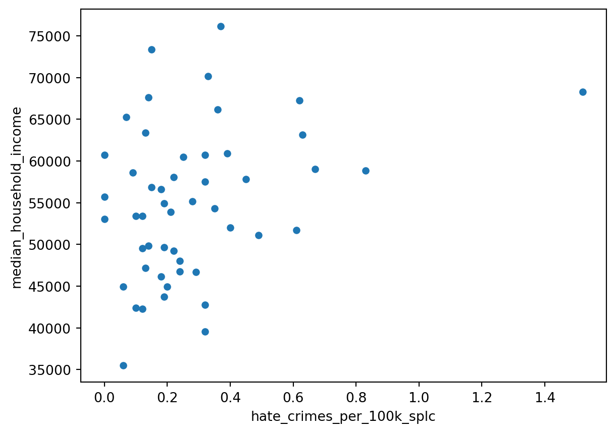
# And the relationship between median household income and hatecrimes based on SPLC data
df.plot(x = 'hate_crimes_per_100k_splc', y = 'median_household_income', kind='scatter')
Hmmm, there doesn’t appear to be a strong (linear!) correlation, but surely there is a cluster and some outliers! That’s our cue - let’s find out which states might be outliers by using the standard deviation function ‘std’.
mean = df.hate_crimes_per_100k_splc.mean()
std = df.hate_crimes_per_100k_splc.std()
df[df.hate_crimes_per_100k_splc > mean + 2.5 * std]| NAME | median_household_income | share_unemployed_seasonal | share_population_in_metro_areas | share_population_with_high_school_degree | share_non_citizen | share_white_poverty | gini_index | share_non_white | share_voters_voted_trump | hate_crimes_per_100k_splc | avg_hatecrimes_per_100k_fbi | |
|---|---|---|---|---|---|---|---|---|---|---|---|---|
| 8 | District of Columbia | 68277 | 0.067 | 1.0 | 0.871 | 0.11 | 0.04 | 0.532 | 0.63 | 0.04 | 1.52 | 10.95 |
Remember that we discussed about ‘context’ earlier when we got 51 states? If your investigation paid off there, you can make better sense of the outlier here.
# Let's try to make the outlier more obvious
# Question: if you change the 2.5 threshold, what happens to the outliers?
import matplotlib.pyplot as plt
outliers_df = df[df.hate_crimes_per_100k_splc > mean + 2.5 * std]
df.plot(x = 'hate_crimes_per_100k_splc', y = 'median_household_income', kind='scatter')
plt.scatter(outliers_df.hate_crimes_per_100k_splc, outliers_df.median_household_income ,c='red')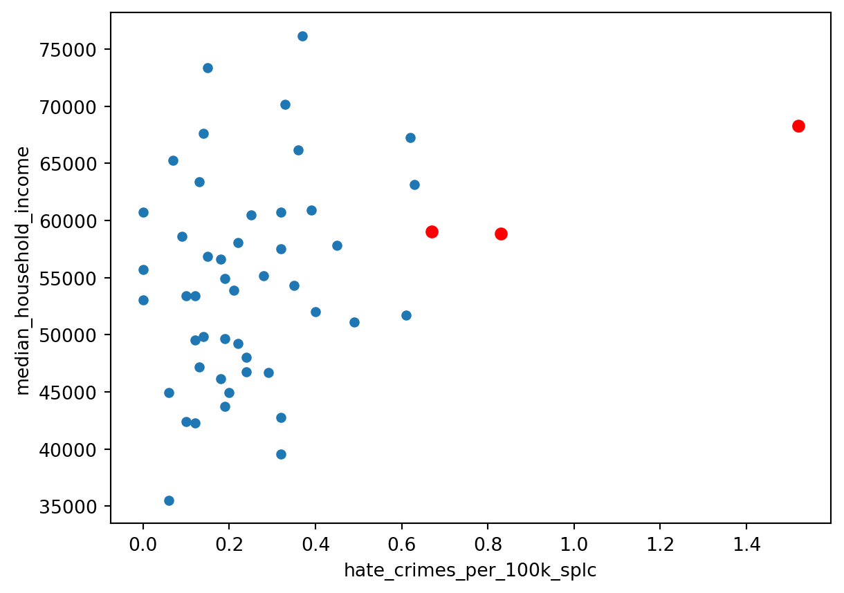
# Let's create a pivot table to focus on specific columns of interest
df_pivot = df.pivot_table(index=['NAME'], values=['hate_crimes_per_100k_splc', 'avg_hatecrimes_per_100k_fbi', 'median_household_income'])
df_pivot| avg_hatecrimes_per_100k_fbi | hate_crimes_per_100k_splc | median_household_income | |
|---|---|---|---|
| NAME | |||
| Alabama | 1.80 | 0.12 | 42278.0 |
| Alaska | 1.65 | 0.14 | 67629.0 |
| Arizona | 3.41 | 0.22 | 49254.0 |
| Arkansas | 0.86 | 0.06 | 44922.0 |
| California | 2.39 | 0.25 | 60487.0 |
| Colorado | 2.80 | 0.39 | 60940.0 |
| Connecticut | 3.77 | 0.33 | 70161.0 |
| Delaware | 1.46 | 0.32 | 57522.0 |
| District of Columbia | 10.95 | 1.52 | 68277.0 |
| Florida | 0.69 | 0.18 | 46140.0 |
| Georgia | 0.41 | 0.12 | 49555.0 |
| Idaho | 1.89 | 0.12 | 53438.0 |
| Illinois | 1.04 | 0.19 | 54916.0 |
| Indiana | 1.75 | 0.24 | 48060.0 |
| Iowa | 0.56 | 0.45 | 57810.0 |
| Kansas | 2.14 | 0.10 | 53444.0 |
| Kentucky | 4.20 | 0.32 | 42786.0 |
| Louisiana | 1.34 | 0.10 | 42406.0 |
| Maine | 2.62 | 0.61 | 51710.0 |
| Maryland | 1.32 | 0.37 | 76165.0 |
| Massachusetts | 4.80 | 0.63 | 63151.0 |
| Michigan | 3.20 | 0.40 | 52005.0 |
| Minnesota | 3.61 | 0.62 | 67244.0 |
| Mississippi | 0.62 | 0.06 | 35521.0 |
| Missouri | 1.90 | 0.18 | 56630.0 |
| Montana | 2.95 | 0.49 | 51102.0 |
| Nebraska | 2.68 | 0.15 | 56870.0 |
| Nevada | 2.11 | 0.14 | 49875.0 |
| New Hampshire | 2.10 | 0.15 | 73397.0 |
| New Jersey | 4.41 | 0.07 | 65243.0 |
| New Mexico | 1.88 | 0.29 | 46686.0 |
| New York | 3.10 | 0.35 | 54310.0 |
| North Carolina | 1.26 | 0.24 | 46784.0 |
| North Dakota | 4.74 | 0.00 | 60730.0 |
| Ohio | 3.24 | 0.19 | 49644.0 |
| Oklahoma | 1.08 | 0.13 | 47199.0 |
| Oregon | 3.39 | 0.83 | 58875.0 |
| Pennsylvania | 0.43 | 0.28 | 55173.0 |
| Rhode Island | 1.28 | 0.09 | 58633.0 |
| South Carolina | 1.93 | 0.20 | 44929.0 |
| South Dakota | 3.30 | 0.00 | 53053.0 |
| Tennessee | 3.13 | 0.19 | 43716.0 |
| Texas | 0.75 | 0.21 | 53875.0 |
| Utah | 2.38 | 0.13 | 63383.0 |
| Vermont | 1.90 | 0.32 | 60708.0 |
| Virginia | 1.72 | 0.36 | 66155.0 |
| Washington | 3.81 | 0.67 | 59068.0 |
| West Virginia | 2.03 | 0.32 | 39552.0 |
| Wisconsin | 1.12 | 0.22 | 58080.0 |
| Wyoming | 0.26 | 0.00 | 55690.0 |
# the pivot table seems sorted by state names, let's sort by FBI hate crime data instead
df_pivot.sort_values(by=['avg_hatecrimes_per_100k_fbi'], ascending=False)| avg_hatecrimes_per_100k_fbi | hate_crimes_per_100k_splc | median_household_income | |
|---|---|---|---|
| NAME | |||
| District of Columbia | 10.95 | 1.52 | 68277.0 |
| Massachusetts | 4.80 | 0.63 | 63151.0 |
| North Dakota | 4.74 | 0.00 | 60730.0 |
| New Jersey | 4.41 | 0.07 | 65243.0 |
| Kentucky | 4.20 | 0.32 | 42786.0 |
| Washington | 3.81 | 0.67 | 59068.0 |
| Connecticut | 3.77 | 0.33 | 70161.0 |
| Minnesota | 3.61 | 0.62 | 67244.0 |
| Arizona | 3.41 | 0.22 | 49254.0 |
| Oregon | 3.39 | 0.83 | 58875.0 |
| South Dakota | 3.30 | 0.00 | 53053.0 |
| Ohio | 3.24 | 0.19 | 49644.0 |
| Michigan | 3.20 | 0.40 | 52005.0 |
| Tennessee | 3.13 | 0.19 | 43716.0 |
| New York | 3.10 | 0.35 | 54310.0 |
| Montana | 2.95 | 0.49 | 51102.0 |
| Colorado | 2.80 | 0.39 | 60940.0 |
| Nebraska | 2.68 | 0.15 | 56870.0 |
| Maine | 2.62 | 0.61 | 51710.0 |
| California | 2.39 | 0.25 | 60487.0 |
| Utah | 2.38 | 0.13 | 63383.0 |
| Kansas | 2.14 | 0.10 | 53444.0 |
| Nevada | 2.11 | 0.14 | 49875.0 |
| New Hampshire | 2.10 | 0.15 | 73397.0 |
| West Virginia | 2.03 | 0.32 | 39552.0 |
| South Carolina | 1.93 | 0.20 | 44929.0 |
| Vermont | 1.90 | 0.32 | 60708.0 |
| Missouri | 1.90 | 0.18 | 56630.0 |
| Idaho | 1.89 | 0.12 | 53438.0 |
| New Mexico | 1.88 | 0.29 | 46686.0 |
| Alabama | 1.80 | 0.12 | 42278.0 |
| Indiana | 1.75 | 0.24 | 48060.0 |
| Virginia | 1.72 | 0.36 | 66155.0 |
| Alaska | 1.65 | 0.14 | 67629.0 |
| Delaware | 1.46 | 0.32 | 57522.0 |
| Louisiana | 1.34 | 0.10 | 42406.0 |
| Maryland | 1.32 | 0.37 | 76165.0 |
| Rhode Island | 1.28 | 0.09 | 58633.0 |
| North Carolina | 1.26 | 0.24 | 46784.0 |
| Wisconsin | 1.12 | 0.22 | 58080.0 |
| Oklahoma | 1.08 | 0.13 | 47199.0 |
| Illinois | 1.04 | 0.19 | 54916.0 |
| Arkansas | 0.86 | 0.06 | 44922.0 |
| Texas | 0.75 | 0.21 | 53875.0 |
| Florida | 0.69 | 0.18 | 46140.0 |
| Mississippi | 0.62 | 0.06 | 35521.0 |
| Iowa | 0.56 | 0.45 | 57810.0 |
| Pennsylvania | 0.43 | 0.28 | 55173.0 |
| Georgia | 0.41 | 0.12 | 49555.0 |
| Wyoming | 0.26 | 0.00 | 55690.0 |
# Let's standardise our data before we attempt further modelling using the data
from sklearn import preprocessing
import numpy as np
# Get the column names first
df_selected_std = df[['median_household_income','share_unemployed_seasonal', 'share_population_in_metro_areas'
, 'share_population_with_high_school_degree', 'share_non_citizen', 'share_white_poverty', 'gini_index'
, 'share_non_white', 'share_voters_voted_trump', 'hate_crimes_per_100k_splc', 'avg_hatecrimes_per_100k_fbi']]
names = df_selected_std.columns
# Create the Scaler object for standardising the data
scaler = preprocessing.StandardScaler()
# Fit our data on the scaler object
df2 = scaler.fit_transform(df_selected_std)
# check what type is df2
type(df2)numpy.ndarray# Let's convert the numpy array into a DataFrame before further processing
df2 = pd.DataFrame(df2, columns=names)
df2.tail(10)| median_household_income | share_unemployed_seasonal | share_population_in_metro_areas | share_population_with_high_school_degree | share_non_citizen | share_white_poverty | gini_index | share_non_white | share_voters_voted_trump | hate_crimes_per_100k_splc | avg_hatecrimes_per_100k_fbi | |
|---|---|---|---|---|---|---|---|---|---|---|---|
| 40 | -0.207459 | -1.421951 | -1.321717 | 0.907229 | NaN | -0.497582 | -0.588999 | -0.911176 | 1.092014 | -1.110547 | 0.551945 |
| 41 | -1.254157 | 0.680396 | 0.385501 | -1.110154 | -0.455183 | 1.541689 | 0.668306 | -0.240207 | 1.005484 | -0.360177 | 0.451784 |
| 42 | -0.115311 | -0.753023 | 0.936216 | -2.059511 | 1.813836 | -0.497582 | 0.716664 | 1.705604 | 0.313240 | -0.281191 | -0.950467 |
| 43 | 0.950557 | -1.326390 | 0.385501 | 1.055566 | -0.455183 | -0.497582 | -1.701230 | -0.776982 | -0.205942 | -0.597136 | 0.009898 |
| 44 | 0.650684 | -1.230829 | -2.202862 | 1.233571 | -1.427620 | 0.318126 | -0.492283 | -1.649243 | -1.417369 | 0.153233 | -0.272909 |
| 45 | 1.261305 | -0.657461 | 0.771002 | -0.071795 | 0.193108 | -0.905436 | 0.233085 | 0.497859 | -0.379003 | 0.311206 | -0.378961 |
| 46 | 0.466836 | 0.202590 | 0.605787 | 0.847894 | 0.841399 | -0.089728 | -0.637357 | 0.028181 | -0.984716 | 1.535493 | 0.852428 |
| 47 | -1.720951 | 2.209376 | -1.101431 | -1.199157 | -1.427620 | 1.949543 | -0.153778 | -1.582146 | 1.697727 | 0.153233 | -0.196315 |
| 48 | 0.356079 | -0.657461 | -0.330429 | 0.877562 | -0.779329 | -0.089728 | -1.169293 | -0.575692 | -0.119412 | -0.241698 | -0.732470 |
| 49 | 0.088155 | -0.944145 | -2.423149 | 1.470910 | -1.103475 | -0.089728 | -1.507798 | -1.045370 | 1.784258 | -1.110547 | -1.239166 |
# Now that our data has been standardised, let's look at the distribution across all columns
ax = sns.boxplot(data=df2, orient="h")
import scipy.stats
# Let's create a correlation matrix by computing the pairwise correlation of numerical columns, rounding correlation values to two places
corrMatrix = df2.corr(numeric_only=True).round(2)
print (corrMatrix) median_household_income \
median_household_income 1.00
share_unemployed_seasonal -0.34
share_population_in_metro_areas 0.29
share_population_with_high_school_degree 0.64
share_non_citizen 0.28
share_white_poverty -0.82
gini_index -0.15
share_non_white -0.00
share_voters_voted_trump -0.57
hate_crimes_per_100k_splc 0.33
avg_hatecrimes_per_100k_fbi 0.32
share_unemployed_seasonal \
median_household_income -0.34
share_unemployed_seasonal 1.00
share_population_in_metro_areas 0.37
share_population_with_high_school_degree -0.61
share_non_citizen 0.31
share_white_poverty 0.19
gini_index 0.53
share_non_white 0.59
share_voters_voted_trump -0.21
hate_crimes_per_100k_splc 0.18
avg_hatecrimes_per_100k_fbi 0.07
share_population_in_metro_areas \
median_household_income 0.29
share_unemployed_seasonal 0.37
share_population_in_metro_areas 1.00
share_population_with_high_school_degree -0.27
share_non_citizen 0.75
share_white_poverty -0.39
gini_index 0.52
share_non_white 0.60
share_voters_voted_trump -0.58
hate_crimes_per_100k_splc 0.26
avg_hatecrimes_per_100k_fbi 0.21
share_population_with_high_school_degree \
median_household_income 0.64
share_unemployed_seasonal -0.61
share_population_in_metro_areas -0.27
share_population_with_high_school_degree 1.00
share_non_citizen -0.30
share_white_poverty -0.48
gini_index -0.58
share_non_white -0.56
share_voters_voted_trump -0.13
hate_crimes_per_100k_splc 0.21
avg_hatecrimes_per_100k_fbi 0.16
share_non_citizen \
median_household_income 0.28
share_unemployed_seasonal 0.31
share_population_in_metro_areas 0.75
share_population_with_high_school_degree -0.30
share_non_citizen 1.00
share_white_poverty -0.38
gini_index 0.51
share_non_white 0.76
share_voters_voted_trump -0.62
hate_crimes_per_100k_splc 0.28
avg_hatecrimes_per_100k_fbi 0.30
share_white_poverty gini_index \
median_household_income -0.82 -0.15
share_unemployed_seasonal 0.19 0.53
share_population_in_metro_areas -0.39 0.52
share_population_with_high_school_degree -0.48 -0.58
share_non_citizen -0.38 0.51
share_white_poverty 1.00 0.01
gini_index 0.01 1.00
share_non_white -0.24 0.59
share_voters_voted_trump 0.54 -0.46
hate_crimes_per_100k_splc -0.26 0.38
avg_hatecrimes_per_100k_fbi -0.26 0.42
share_non_white \
median_household_income -0.00
share_unemployed_seasonal 0.59
share_population_in_metro_areas 0.60
share_population_with_high_school_degree -0.56
share_non_citizen 0.76
share_white_poverty -0.24
gini_index 0.59
share_non_white 1.00
share_voters_voted_trump -0.44
hate_crimes_per_100k_splc 0.12
avg_hatecrimes_per_100k_fbi 0.08
share_voters_voted_trump \
median_household_income -0.57
share_unemployed_seasonal -0.21
share_population_in_metro_areas -0.58
share_population_with_high_school_degree -0.13
share_non_citizen -0.62
share_white_poverty 0.54
gini_index -0.46
share_non_white -0.44
share_voters_voted_trump 1.00
hate_crimes_per_100k_splc -0.69
avg_hatecrimes_per_100k_fbi -0.50
hate_crimes_per_100k_splc \
median_household_income 0.33
share_unemployed_seasonal 0.18
share_population_in_metro_areas 0.26
share_population_with_high_school_degree 0.21
share_non_citizen 0.28
share_white_poverty -0.26
gini_index 0.38
share_non_white 0.12
share_voters_voted_trump -0.69
hate_crimes_per_100k_splc 1.00
avg_hatecrimes_per_100k_fbi 0.68
avg_hatecrimes_per_100k_fbi
median_household_income 0.32
share_unemployed_seasonal 0.07
share_population_in_metro_areas 0.21
share_population_with_high_school_degree 0.16
share_non_citizen 0.30
share_white_poverty -0.26
gini_index 0.42
share_non_white 0.08
share_voters_voted_trump -0.50
hate_crimes_per_100k_splc 0.68
avg_hatecrimes_per_100k_fbi 1.00
Time for reflection:
Look at the positive and negative correlation values above. What do they suggest and how strong, weak or moderate is the correlation.
# Let's create a heatmap to visualse the pairwise correlations for better understanding
corrMatrix = df2.corr(numeric_only=True).round(1) #Rounding to (1) so it's easier to read given number of variables
sns.heatmap(corrMatrix, annot=True)
plt.show()
# Let's now perform a linear regression on our data
# Try the commented code after you run this first
from sklearn.linear_model import LinearRegression
from sklearn import metrics
# identify the independent variables
x = df2[['median_household_income', 'share_population_with_high_school_degree', 'share_voters_voted_trump']]
# identify the dependent variable
y = df2[['avg_hatecrimes_per_100k_fbi']]
# What if we change the data (y variable)
#y = df2[['hate_crimes_per_100k_splc']]
lin_model = LinearRegression(fit_intercept = True)
lin_model.fit(x, y)
print("Coefficients:", lin_model.coef_)
print ("Intercept:", lin_model.intercept_)
# Generate predictions from our linear regression model, and check the MSE, Rsquared and Variance measures to assess performance
y_hat = lin_model.predict(x)
print ("MSE:", metrics.mean_squared_error(y, y_hat))
print ("R^2:", metrics.r2_score(y, y_hat))
print ("var:", y.var())Coefficients: [[-0.0861606 0.15199564 -0.53470881]]
Intercept: [2.12745505e-16]
MSE: 0.7326374635746324
R^2: 0.2673625364253678
var: avg_hatecrimes_per_100k_fbi 1.020408
dtype: float64What do these values suggest?
Note
Remember the earlier note about the maps looking different? Were you able to identify what’s going there?
Let’s revisit that part again
The maps did not share comparable scales. The first map was showing the annual crime rate per 100k residents, while the second map was showing the total incident numbers per 100k resident only for the 10-days following the 2016 election. How can we fix this discrepency?
Your Turn
Tweak the ??s below to visualise changes
# #| error: true
# # We can generete two new "features" and add them to the DataFrame df
# df['hate_crimes_per_100k_splc_perday'] = df['hate_crimes_per_100k_splc'] / ??
# # the 'avg_hatecrimes_per_100k_fbi' column is an annual incidence average between 2010- 15, so each data value is the number of incidences (per 100k residents) in an average year.
# df['avg_hatecrimes_per_100k_fbi_perday'] = df['avg_hatecrimes_per_100k_fbi'] / ???# #| error: true
# # Update geo_states
# geo_states = geo_states.merge(df, on='????')# # Let's plot again
# # First the PRE election map
# pre_election_map = alt.Chart(geo_states, title='PRE-election Hate crime per 100k per day').mark_geoshape().encode(
# alt.Color('avg_hatecrimes_per_100k_fbi_perday', scale=alt.Scale(domain=[0, 0.15])),
# tooltip=['NAME', 'avg_hatecrimes_per_100k_fbi_perday']
# ).properties(
# width=500,
# height=300
# ).project(
# type='albersUsa'
# )
# post_election_map = alt.Chart(geo_states, title='POST-election Hate crime per 100k per day').mark_geoshape().encode(
# alt.Color('hate_crimes_per_100k_splc_perday', scale=alt.Scale(domain=[0, 0.15])),
# tooltip=['NAME', 'hate_crimes_per_100k_splc_perday']
# ).properties(
# width=500,
# height=300
# ).project(
# type='albersUsa'
# )
# new_combined_map = pre_election_map | post_election_map
# new_combined_mapHow is that now?